Cru’s visual identity is a unified system comprising core elements such as brandmark, typography, and color, as well as extended expressions including supporting graphic elements and photography. This wide range of tools is designed to be flexible and expandable.
To effectively define the Cru brand, these core elements must be aligned across every touchpoint.
Our brand personality when we speak is wise, welcoming, and confident. Our corresponding brand look is bright, bold, and connected.
Refer to these three principles when designing for Cru and ensure they are being considered. Asking yourself or others, “Does this feel Bright, Bold and Connected?” is a great way to enforce our brand and remain consistent with our vision.
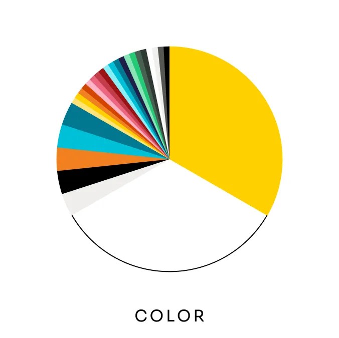
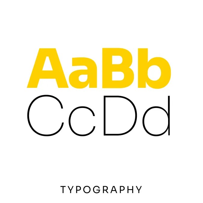
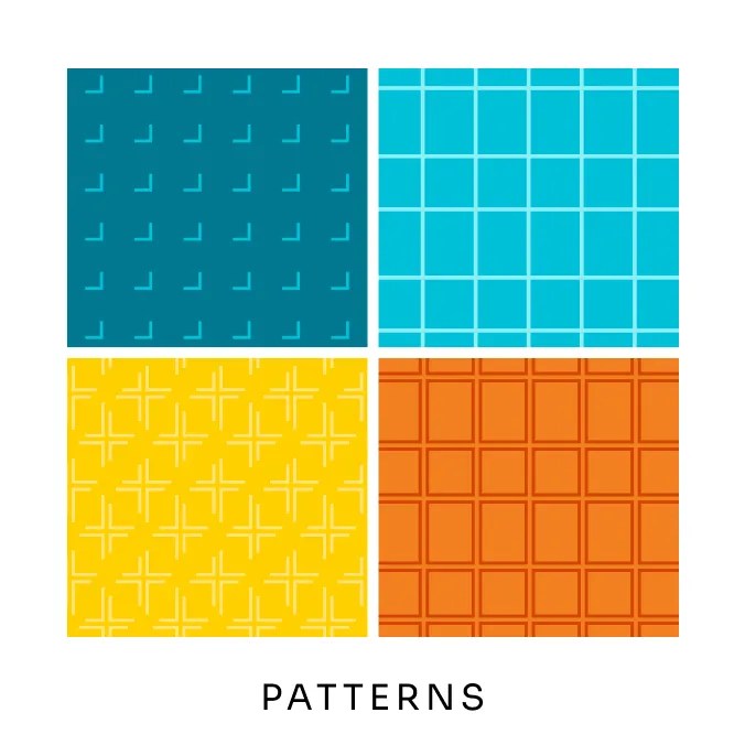
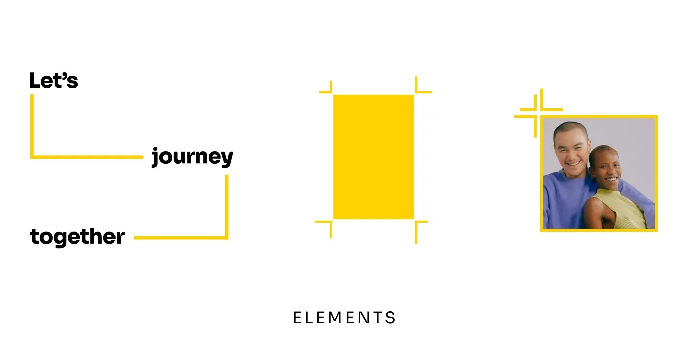
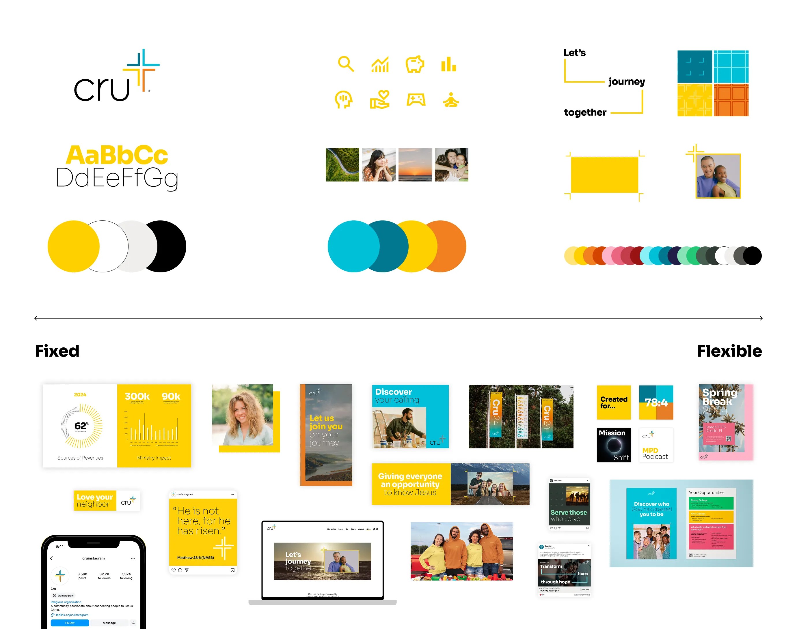
The Cru visual identity is a flexible system comprised of core elements such as the brandmark, typography, and color, as well as extended expressions including imagery, patterns, visual elements, and additional colors.
These brand elements can be grouped into three groups: the fully fixed, the adjustable, and the fully flexible. Depending on what is being created, and the audience, more or less flexibility is permitted.
For example, wayfinding signage or anything very close to the parent brand should be created with fixed elements in mind. On the other hand, special-event materials or anything far from the parent brand would be created with flexible elements in mind.
Flexible elements are intended to change and evolve with the times. We see the flexible brand elements shown here as having a 5- to 10-year “shelf life” before they need to be refreshed.
Fixed elements are the anchors of our brand and serve as the foundation of our visual recognition. They are the most precious and valuable assets and appear consistently throughout the system.
Flexible elements are less precious and allow our brand to evolve and to stay relevant over time. They should be applied consistently and only changed with intention.