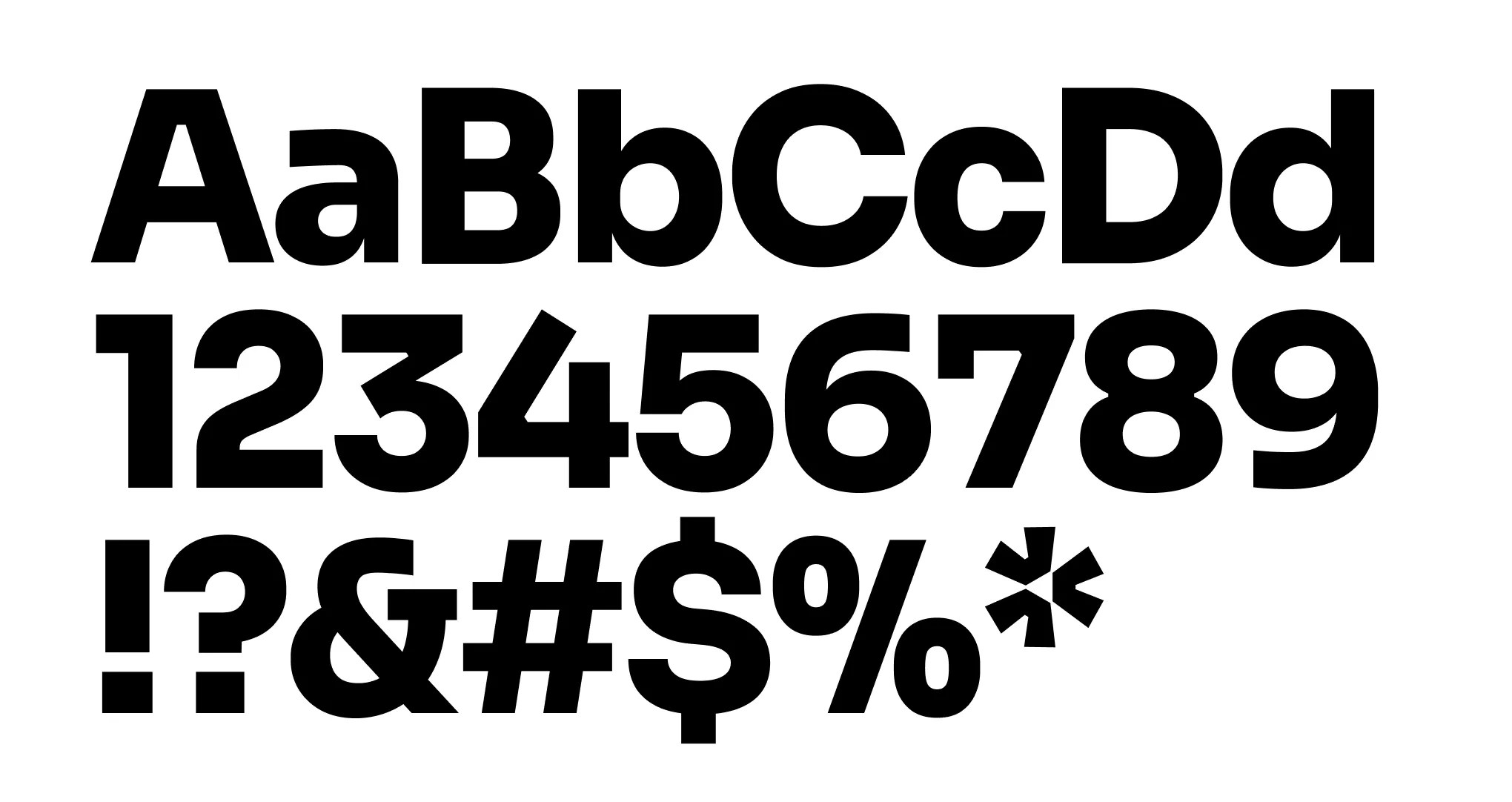
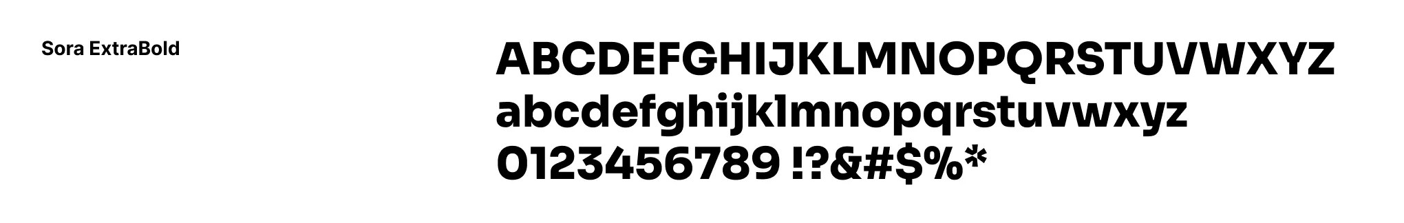
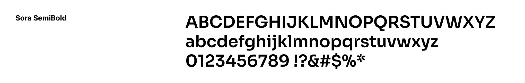
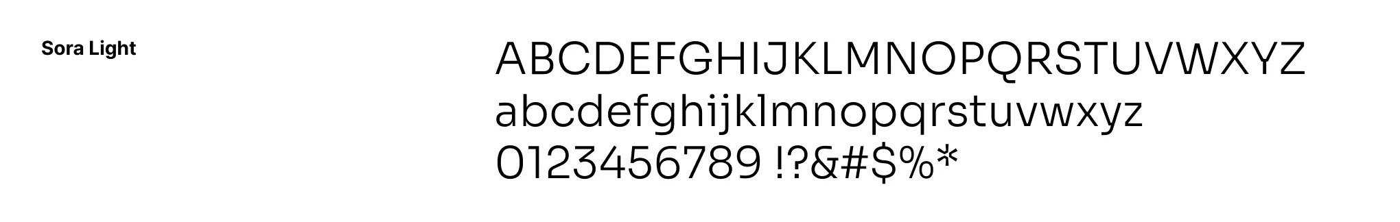
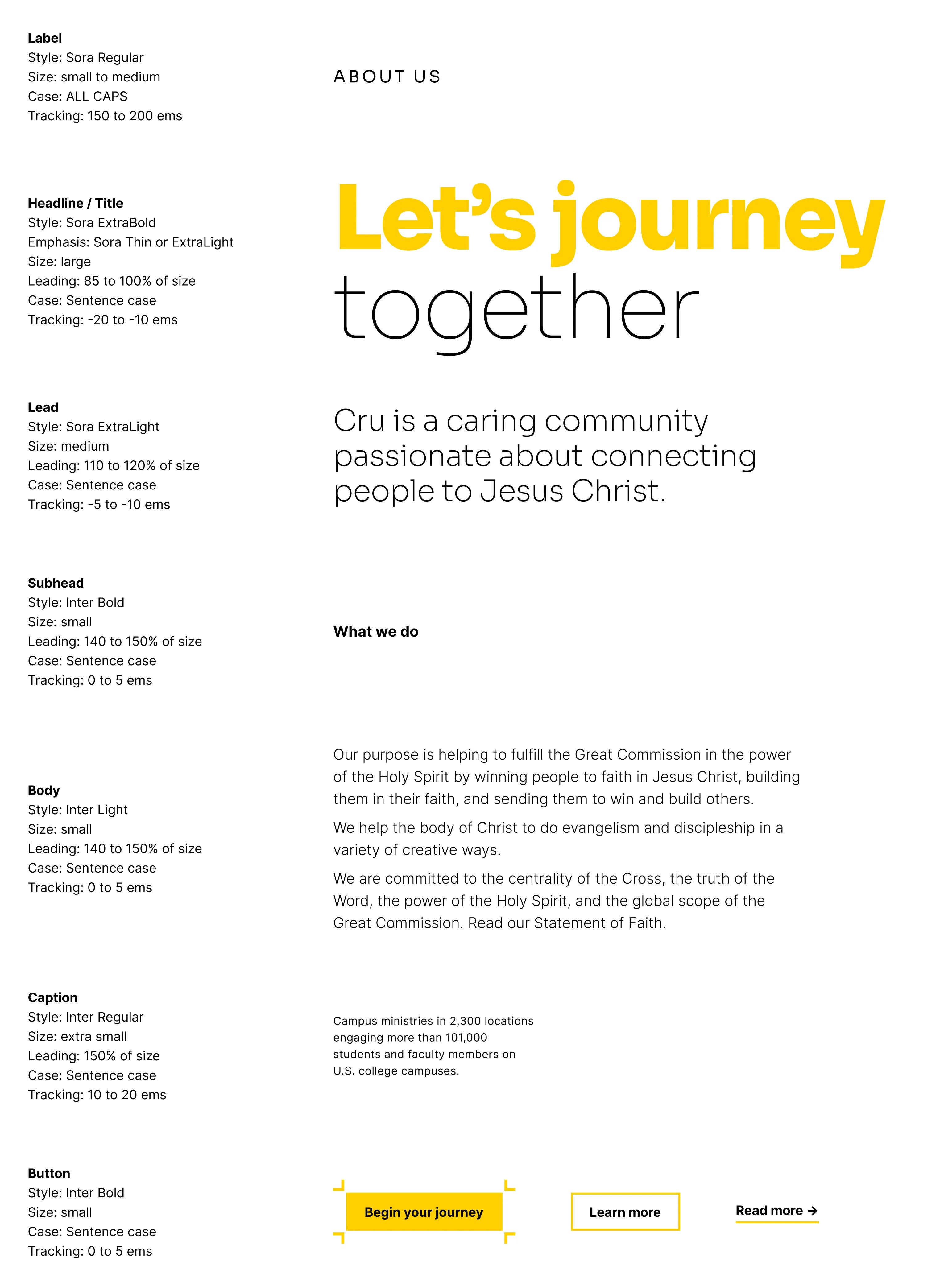
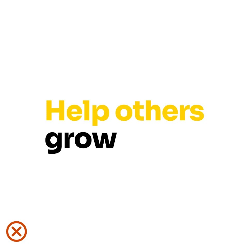
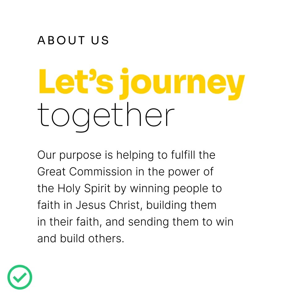
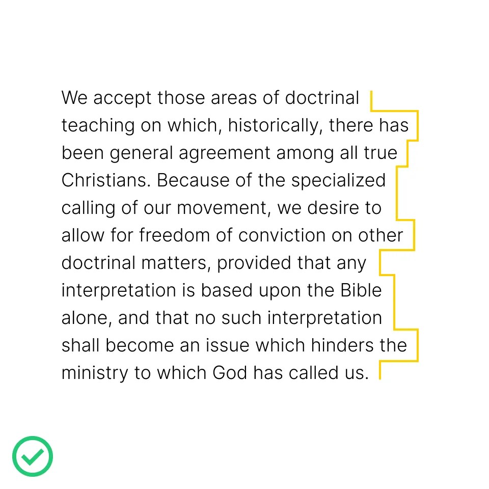
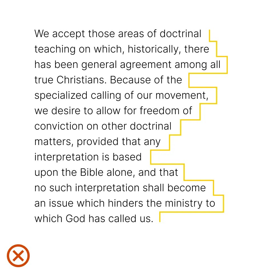
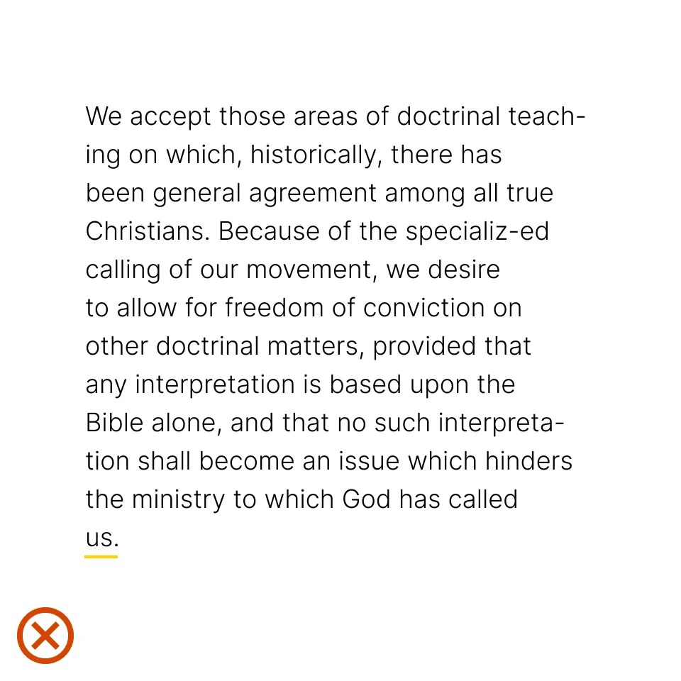
Typography is one of the most, if not the most, important communication tool for our brand. It carries our brand voice and with it we establish our tone, personality, and message.
Our typography system is streamlined for visual efficiency and simplicity. It’s vital that this guidance is followed as carefully and accurately as possible.
Cru’s primary typeface is Sora. It should be used as frequently as possible, especially for key, high-level communication.
Sora is available in 7 distinct weights. Refer to the Text Hierarchy section for details on its use.
Our secondary typeface, Inter, supports Sora without competing with it. Inter is primarily used for body copy. Refer to the Text Hierarchy section for details on its use.
Our brand follows a strict typographic system — the size, font, and layout of different pieces of text — to create a hierarchical division that can show users where to look for specific types of information. It’s important to follow this system in order to establish order in content.
By creating different sizes, shapes, and blocks of text, designers can direct the user’s eye to the information that an audience needs the most, or otherwise categorize that information visually for the audience. The following examples demonstrate our typographic hierarchy system.
When situations arise that require a non-Latin alphabet, our International Typeface Noto may be used in place of Sora and Inter. The Noto font family supports 1,000 languages and over 150 writing systems.
In headlines and titles, words or parts of sentences may be emphasized using a lighter weight of Sora. It’s important that this is done consistently. Emphasized word(s) should always be the last line of the headline or title.
Refer to the diagrams shown here for specifics.
Tracking is the overall spacing between groups of letters, and kerning is the spacing between individual letter forms. The tracking of body text can usually be left as it was designed: 0 units of tracking.
The larger the text, the tighter the tracking should be. A maximum of 15 units of tracking can be subtracted for very large headlines.
For optimal readability, up to 10 units of tracking can be added to very small text, such as captions.
Kerning should always be left on the Metrics option, not Optical.
The two examples shown here are too tight.
The two examples shown here are too loose.
Paragraph alignment refers to how the left and right edges of a paragraph align on a page.
Flush left creates strong alignment for the eye to follow, aiding readability and organization. It is our standard for most typography across the Cru brand because it is functional, modern, timeless, and the most effective in information design and legibility.
In general, avoid center-aligning long paragraphs of text. However, depending on the layout, short sentences or titles may be center-aligned.
A rag is the uneven side of a paragraph — most often on the right side when text is left-aligned, as shown here. Always look for opportunities to improve rags. A good rag is one where the lines move in and out in small increments. A bad rag creates distracting shapes of irregular white space in the margins, where line breaks are varied and inconsistent.
A widow is a short line or single word at the end of a paragraph. Watch out for widows and adjust line lengths with a writer to solve awkward breaks which can affect reading quality. In cases where it is not possible to respect these rules, hyphenation can also be a good solution. Only words that are eight letters or longer can be hyphenated.
The examples shown here illustrate incorrect uses of typography.
- Don’t mix unapproved styles.
- Don’t use the wrong case type.
- Don’t outline.
- Don’t add a period or exclamation mark to headlines.
- Don’t apply effects.
- Don’t use unapproved typefaces.