Yellow
Color plays an important role in establishing a distinct and consistent identity. The Cru brand colors are split into three groups: the primary palette, secondary palette, and tertiary palette.
For most U.S. Cru communications, use the primary palette. When more expression is needed, use the secondary palette. For situations when further expression and flexibility are needed, such as for events and specific markets, the tertiary palette may be used. Refer to the chart below for usage ratio recommendations.

The primary palette should be used first and foremost, as it is what our clients and partners know us for best.
After our logo, the color yellow is our most recognized brand asset. The color yellow is the most luminous of all the colors in the spectrum and captures our attention more than any other color. Use it strategically to focus your audience’s attention.
Even though white is technically not a color, we use it as one. White “space” is important when we are creating communications for our audiences. When white space is balanced well with content, it increases readability and comprehension.


White
Gray
Black
The secondary palette exists to support the primary palette and to keep things fresh and engaging. In particular, this palette is best suited for backgrounds and sometimes text or element color.
Orange
Cyan
Turquoise
The tertiary palette is the most flexible of the three and should be used only when needed. It is especially handy when differentiation is needed for information, events, or campaigns, for example.
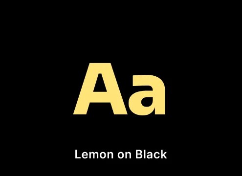
Lemon
RGB 255 / 227 / 120
HEX #FFE378
C=0 M=3 Y=43 K=0
PMS 1205 C/U
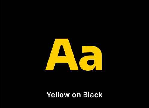
Yellow
RGB 255 / 208 / 0
HEX #FFD000
C=0 M=14 Y=100 K=0
PMS 116 C/U
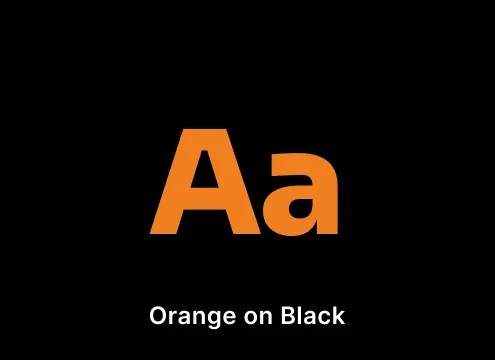
Orange
RGB 240 / 128 / 32
HEX #F08020
C=0 M=60 Y=100 K=0
PMS 151 C/U
Vermilion
RGB 211 / 68 / 0
HEX #D34400
C=0 M=82 Y=94 K=2
PMS 173 C/U
Rose
RGB 255 / 180 / 200
HEX #FFB4C8
C=0 M=23 Y=6 K=0
PMS 196 C/U
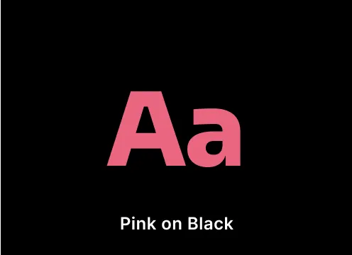
Pink
RGB 234 / 101 / 127
HEX #EA657F
C=0 M=65 Y=25 K=0
PMS 1777 C/U
Cerise
RGB 194 / 60 / 73
HEX #C23C49
C=6 M=91 Y=53 K=16
PMS 703 C/U
Ruby
RGB 153 / 19 / 19
HEX #991313
C=7 M=100 Y=68 K=32
PMS 201 C/U
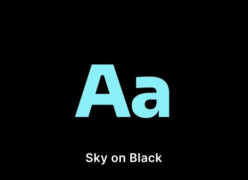
Sky
RGB 137 / 239 / 247
HEX #89EFF7
C=34 M=0 Y=6 K=0
PMS 304 C/U
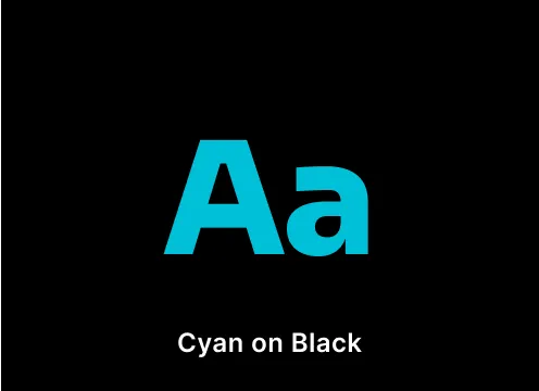
Cyan
RGB 0 / 192 / 216
HEX #00C0D8
C=75 M=0 Y=5 K=0
PMS 306 C/U
Turquoise
RGB 0 / 120 / 144
HEX #007890
C=98 M=6 Y=10 K=29
PMS 633 C/U
Navy
RGB 31 / 31 / 71
HEX #1F1F47
C=100 M=95 Y=5 K=39
PMS 2758 C/U
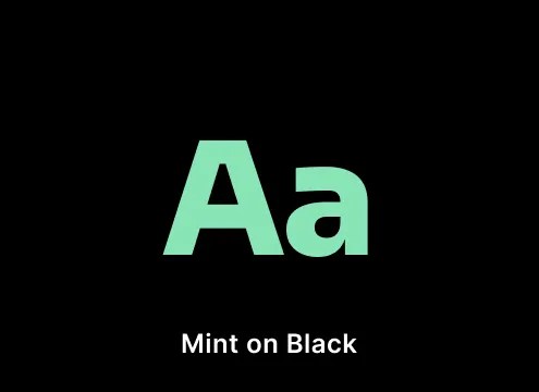
Mint
RGB 136 / 228 / 182
HEX #88E4B6
C=32 M=0 Y=30 K=0
PMS 344 C/U
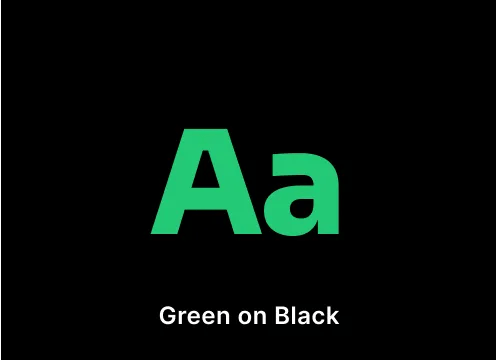
Green
RGB 36 / 201 / 118
HEX #24C976
C=70 M=0 Y=65 K=0
PMS 2414 C/U
Moss
RGB 71 / 96 / 82
HEX #476052
C=46 M=18 Y=44 K=37
PMS 5625 C/U
Olive Drab
RGB 46 / 58 / 51
HEX #2E3A33
C=82 M=36 Y=83 K=90
PMS 5605 C/U
White
RGB 255 / 255 / 255
HEX #FFFFFF
C=0 M=0 Y=0 K=0
N/A
Gray
RGB 240 / 239 / 238
HEX #F0EFEE
C=3 M=3 Y=6 K=7
PMS Warm Gray 1 C/U
Graphite
RGB 86 / 86 / 82
HEX #565652
C=62 M=56 Y=56 K=16
PMS 2334 C/U
Black
RGB 0 / 0 / 0
HEX #000000
C=20 M=20 Y=30 K=100
PMS Black 6 C/U
The examples shown here illustrate correct use of the brandmark when applied to color.
When applied to a colored background, the brandmark can be black or white only. Follow the examples shown here for optimal contrast accessibility.
Note that using the brandmark on tertiary palette colors is appropriate for ministries extensions such as the Campus, City, or Military ministries.
Don’t use any combinations that are not shown here, unless they are purely for decorative purposes.
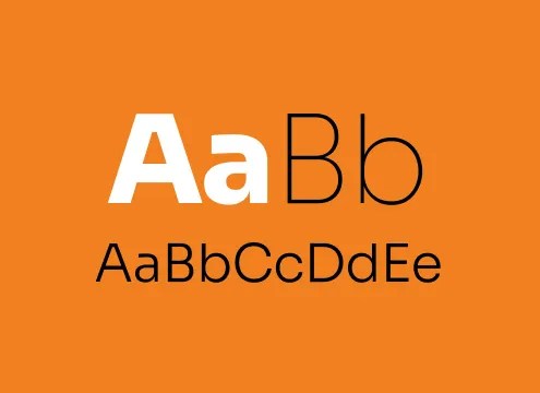
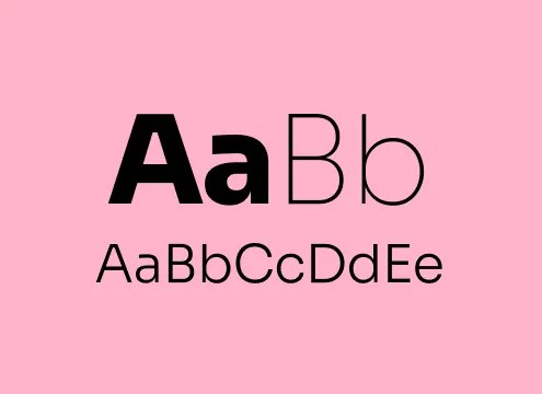
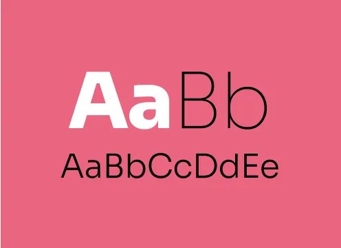
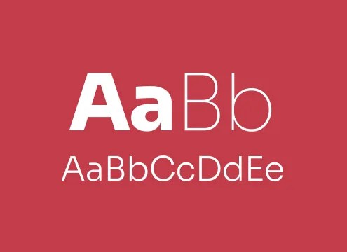
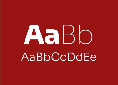
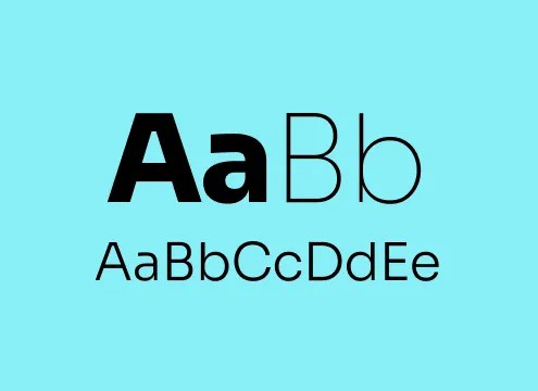
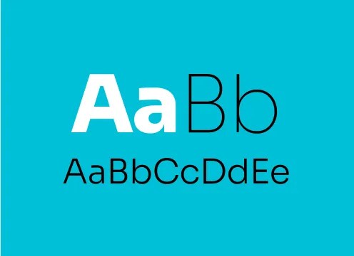
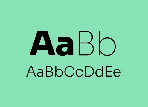
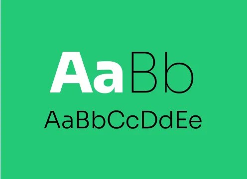
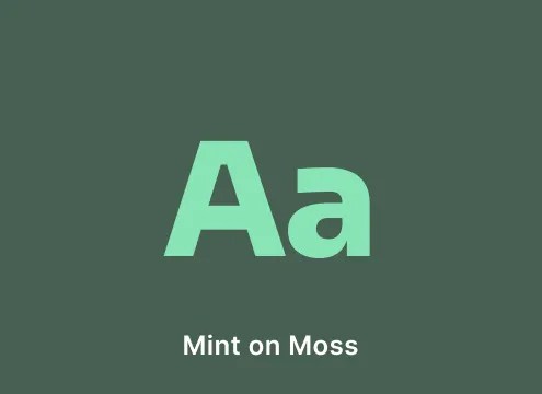
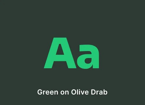
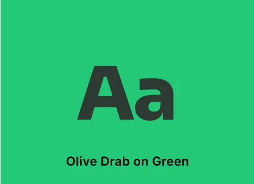
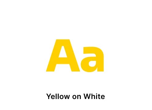
The examples shown here illustrate correct use of small text, large text, and other graphical objects when applied to color.
Note that small text should only be black or white, depending on the color.
Large text, such as headlines or titles, can utilize white or yellow when desired, according to the examples shown.
All text shown here passes the WCAG AA standard unless otherwise stated. Refer to the official WCAG 2.1 specification for details.
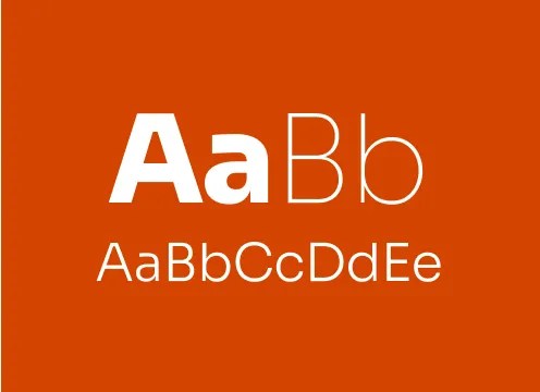
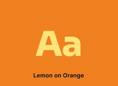
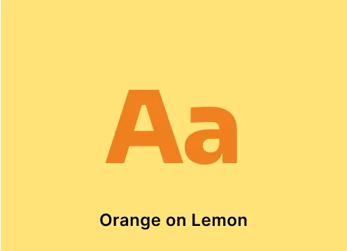
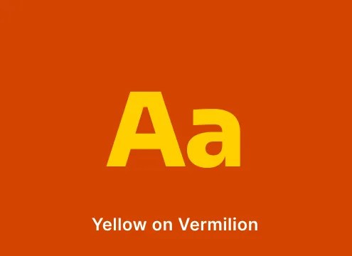
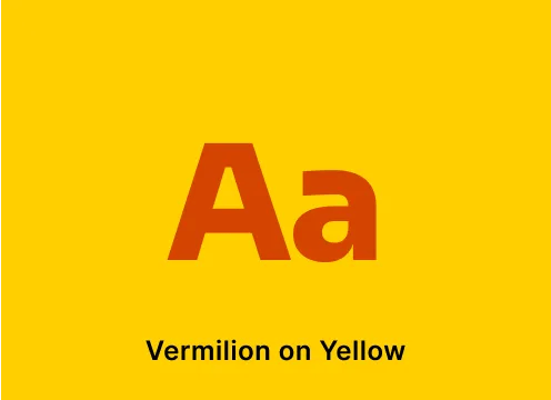
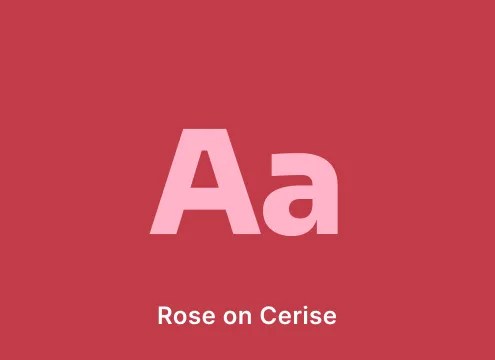
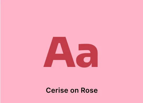
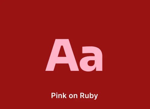
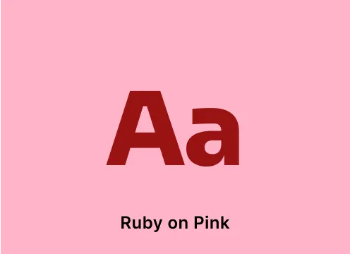
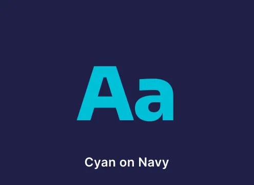
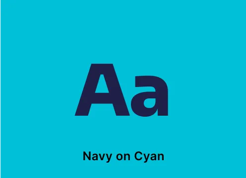
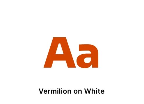
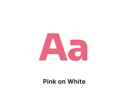
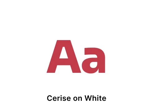
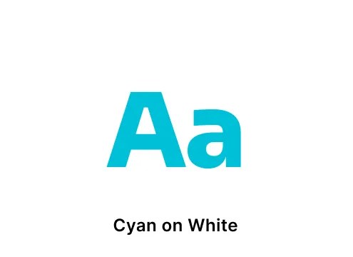
The examples shown here illustrate correct use of large text and other graphical objects when applied to color from the tertiary palette. Don’t apply these combinations to small text.
Don’t use any combinations that are not shown here, unless they are purely for decorative purposes.
The examples shown here illustrate correct use of large text and other graphical objects when applied to color from the tertiary palette. Don’t apply these combinations to small text.
Don’t use any combinations that are not shown here, unless they are purely for decorative purposes.
The chart shown here illustrates other color combinations that are allowed for non-text items, such as background, patterns, or other elements. Be mindful of contrast accessibility when using these combinations in certain situations.