Logos are the clearest way for us to express the Cru visual identity. Our brandmark is what makes us most recognizable and should always be applied consistently.
Since we are one brand, it’s important to use the Cru brandmark first and foremost, unless otherwise stated. Follow the guidelines below for treatment of products, resources, events, partnerships, and more as logos.

Our brandmark is our most recognizable asset and should be used simply and consistently across all communications.

When displayed on a black background, “cru” can be made white to provide ample legibility.
Additionally, our brandmark can be displayed in solid black and solid white for situations that call for it, such as on colored backgrounds, photography, or when printing limitations apply. Refer to the Color chapter for detailed information.
Our symbol, the cross, represents the intersection of people, the nations, our humanity, and God. The combination of the colors and lines illustrates the four corners of the world converging in unity.
The symbol works well as a shorthand for our brandmark. It can be used when there is limited space available or where context already exists for our visual brand identity. However, it should not act as a replacement to the brandmark.
Additionally, our symbol can be displayed in solid black and solid white for situations that call for it, such as on colored backgrounds, photography, or when printing limitations apply. Refer to the Color chapter for detailed information.
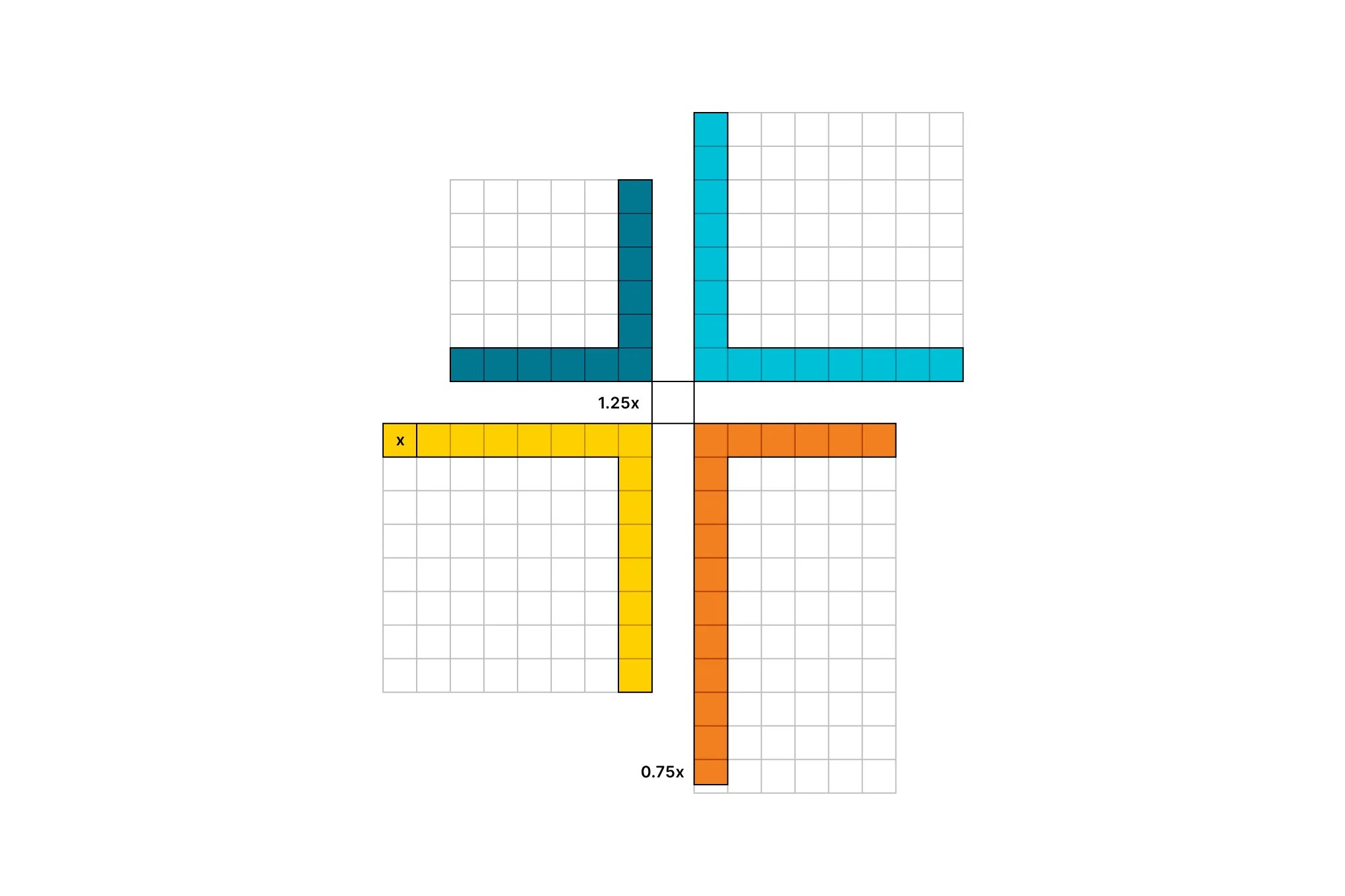
Our symbol is constructed using a grid. However, please note that the four angled shapes are separated by 1.25 times their stroke weight. Additionally, the height of the bottom-right orange shape is 10.75 times the stroke weight.
Refer to this diagram when constructing signage or other applications that feature the symbol in very large scale.
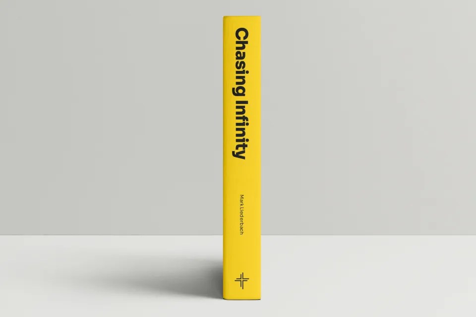
Some examples of where the symbol is best used are as a social media icon or as a colophon on the spine of a book.
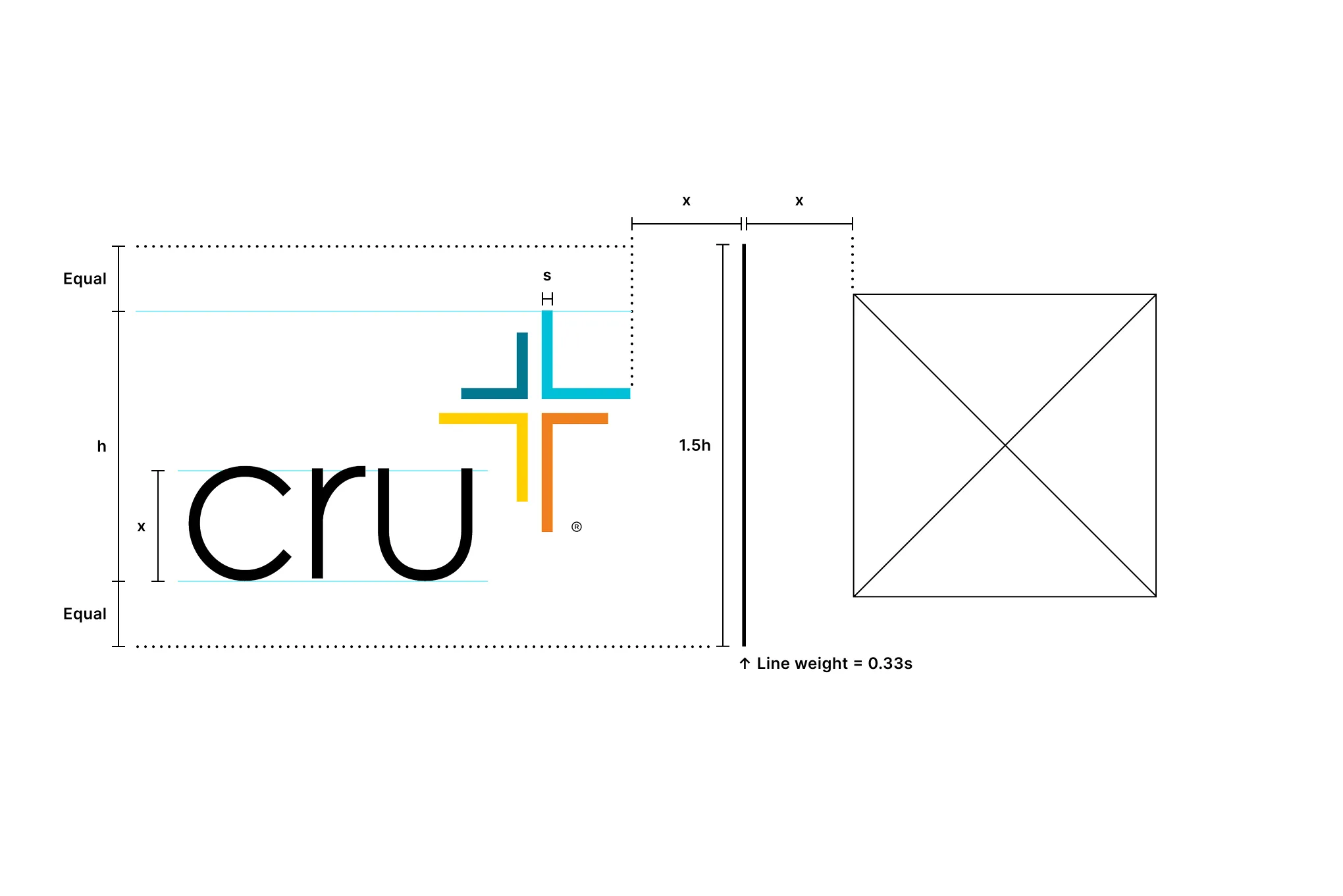
The exclusion zone ensures the legibility and impact of the brandmark. This space prevents the brandmark from being placed too close to the edge of a document or surrounding words and imagery.
The minimum space around the brandmark is equal to the height and width of the top right cyan-colored shape in the symbol (as shown in the diagram). This space should be maintained at all sizes and scaled proportionately with the brandmark.
This space should be considered the absolute minimum safe distance; in most cases, the brandmark should be given even more space to breathe.
The exclusion zone should be applied to the symbol in the same manner as the brandmark when it is used.
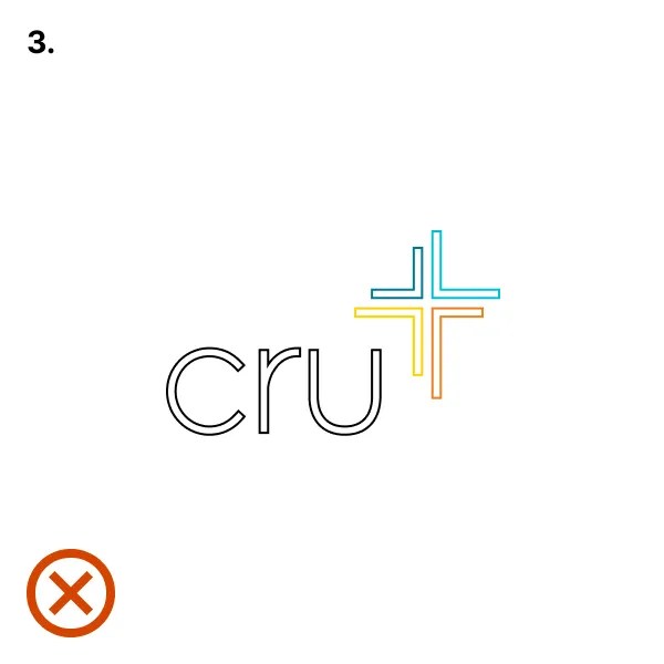
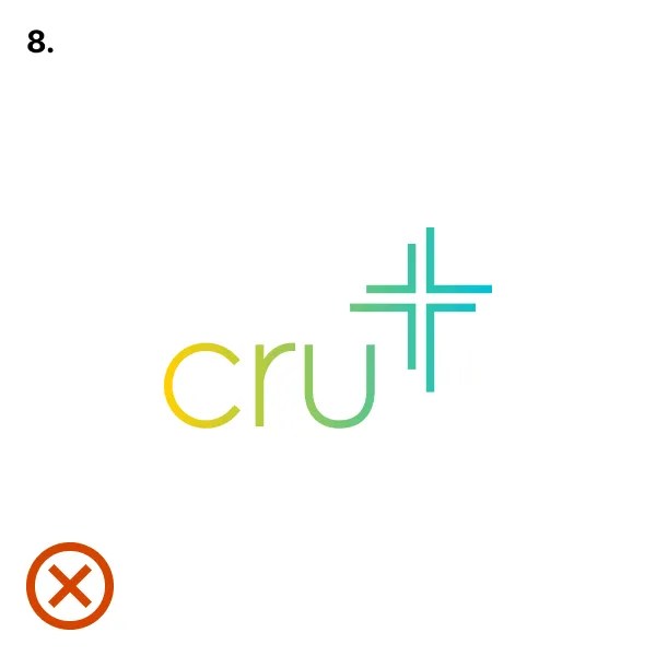
The examples shown here illustrate incorrect uses of the brandmark.
- Don’t alter the size relationship.
- Don’t stretch or manipulate.
- Don’t outline.
- Don’t alter space between letters.
- Don’t add drop shadows or effects.
- Don’t use imagery or texture as a fill.
- Don’t use unapproved colors.
- Don’t apply gradients.
- Don’t use with inadequate contrast.
Additionally, do not use unique brandmark lockups or create new ones, such as the examples shown here. Refer to the application section for examples on how to write your campus name.
Products and resources benefit from a unique stand-alone identity. However, they still must be visually connected to the Cru parent brand.
When creating a new logo for a product or resource, use the template. In general, follow the guidelines below when creating a symbol:
- Keep it simple.
- Use market-related colors.
- Follow brand typographic rules.
- Use basic geometric shapes.
- Consider the use.
- Be consistent.
Templates are available in three configurations with two type styles each.
Events may use the event logo template for promoting the event or feature on merchandise.
Note: The template does not need to be used when the event name is featured in a headline.
Endorsements should always be applied consistently using our endorsement template. Place the endorsement in the bottom right corner of the logo and space it according to the diagram shown here.
The endorsement may be made any color, but it is recommended to use a color from the logo that does not draw emphasis or compete with the logo.
Partnerships should always use our partnership template. The partner’s logo should feel equal in scale to the Cru brandmark. This must be done by eye as making them the same size may make one feel smaller than the other.
Space the partner logo according to the diagram shown here. Both the Cru brandmark and the partner logo should be centered vertically with the dividing line.