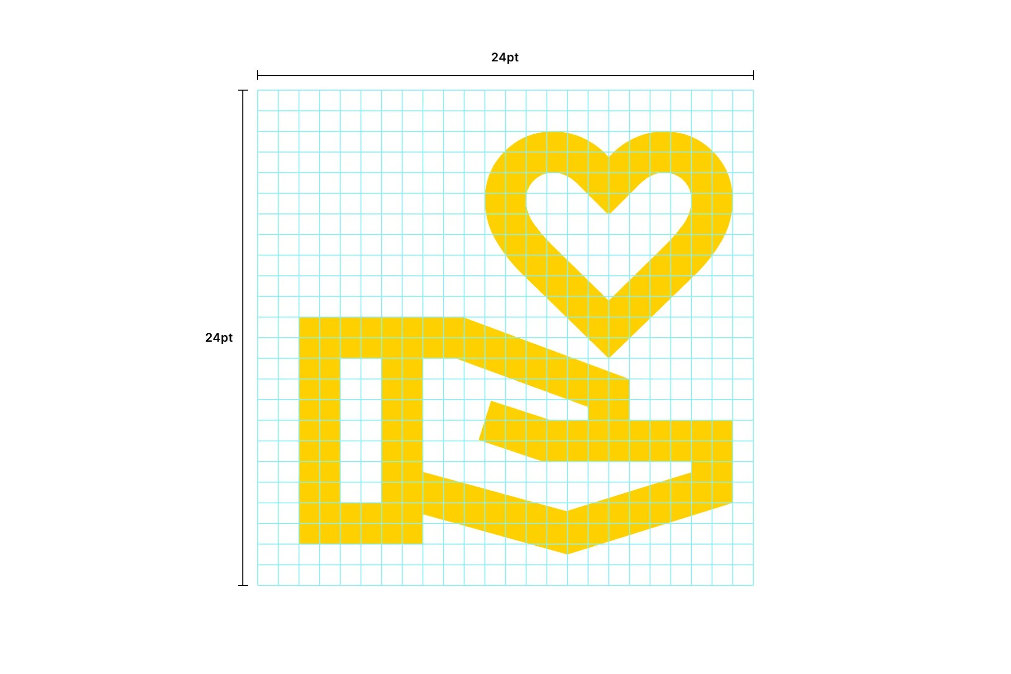
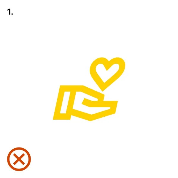
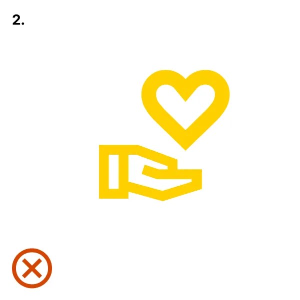
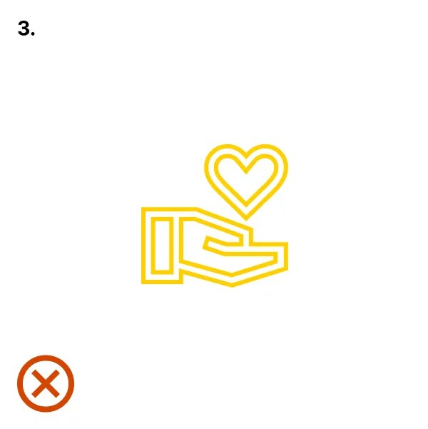
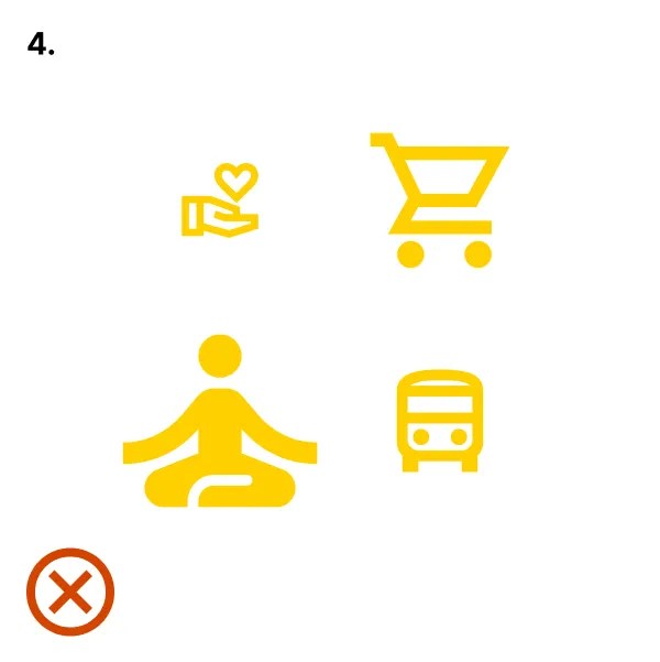
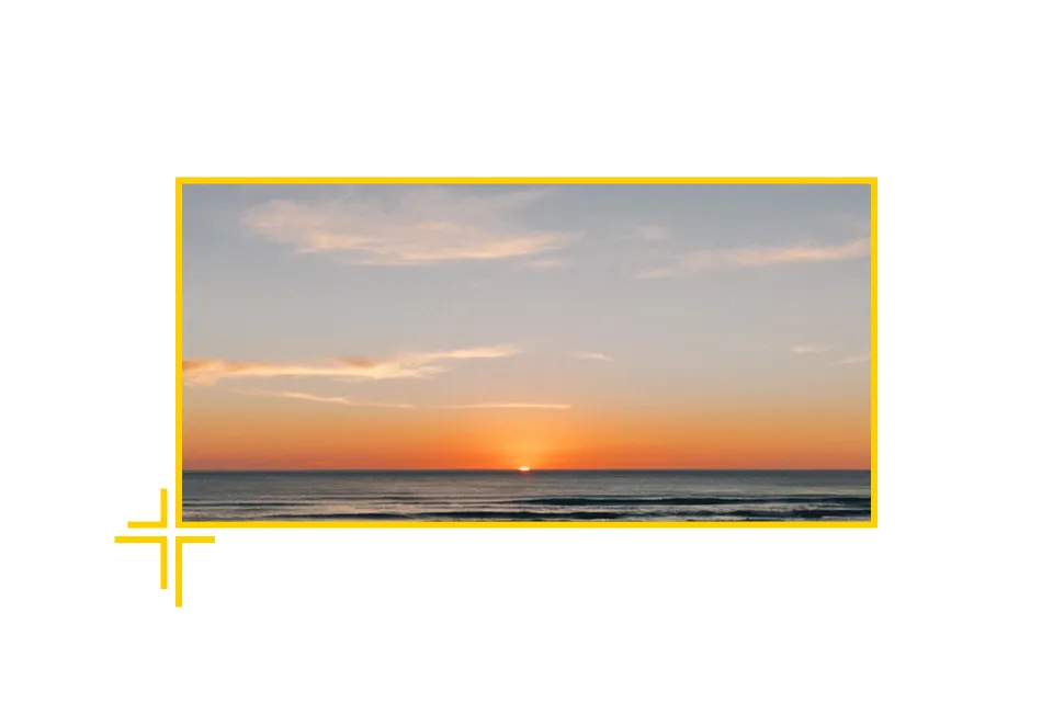
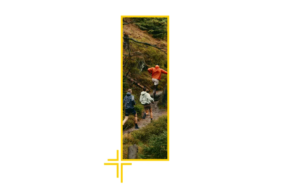
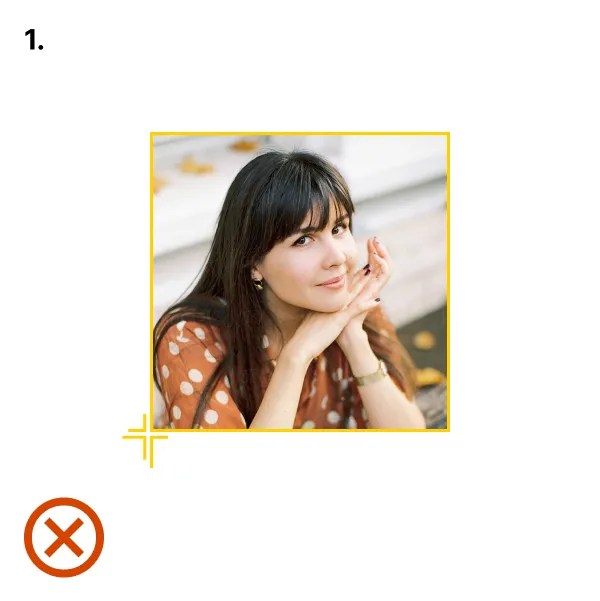
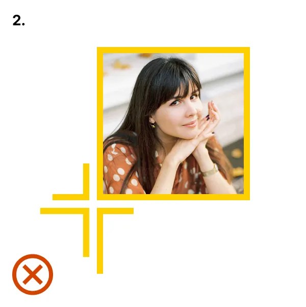
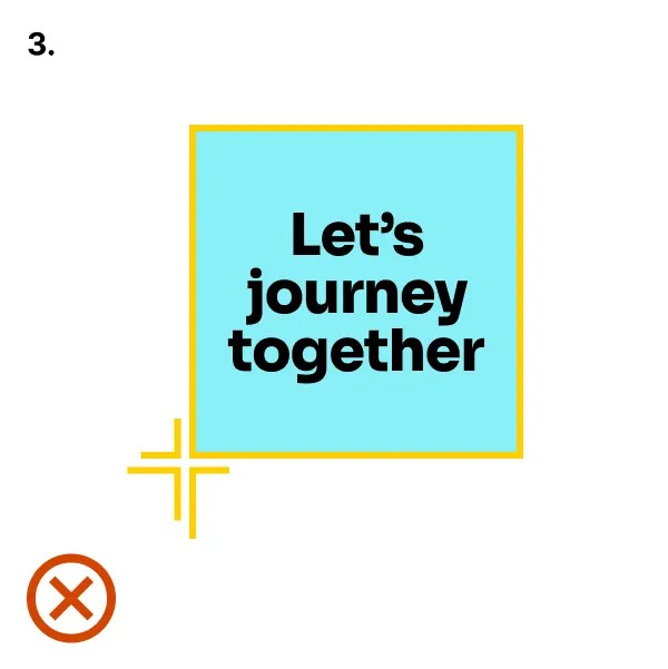
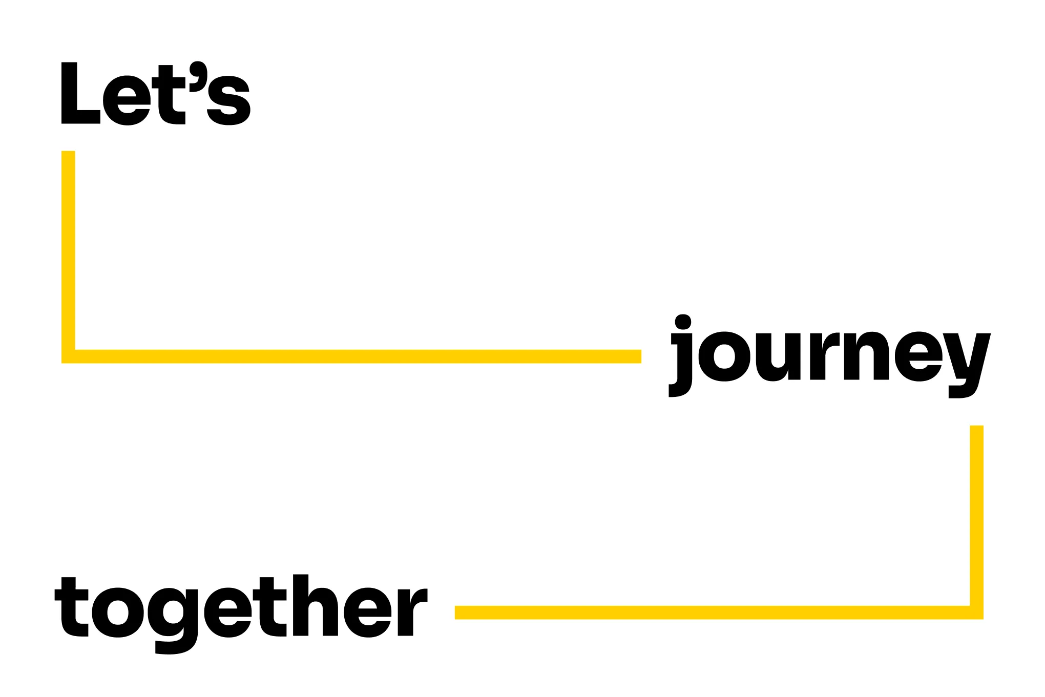
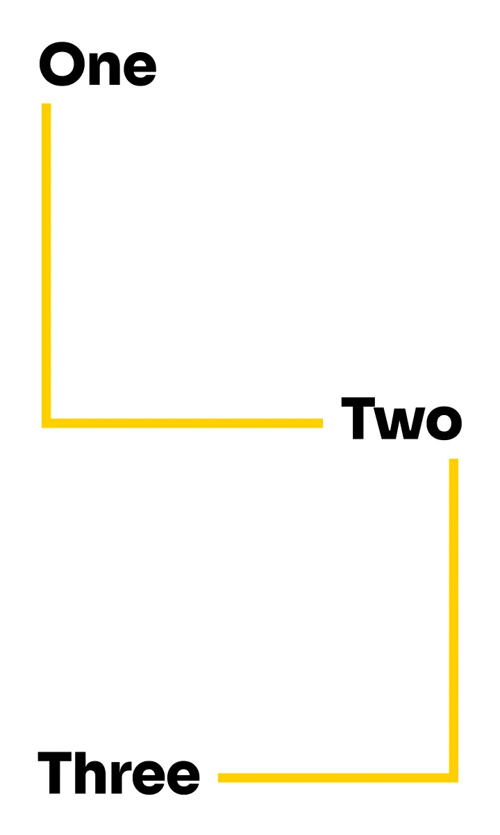
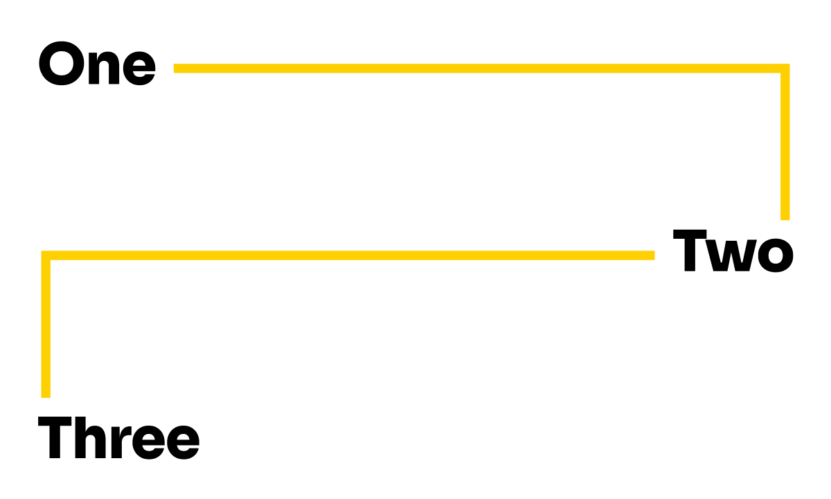
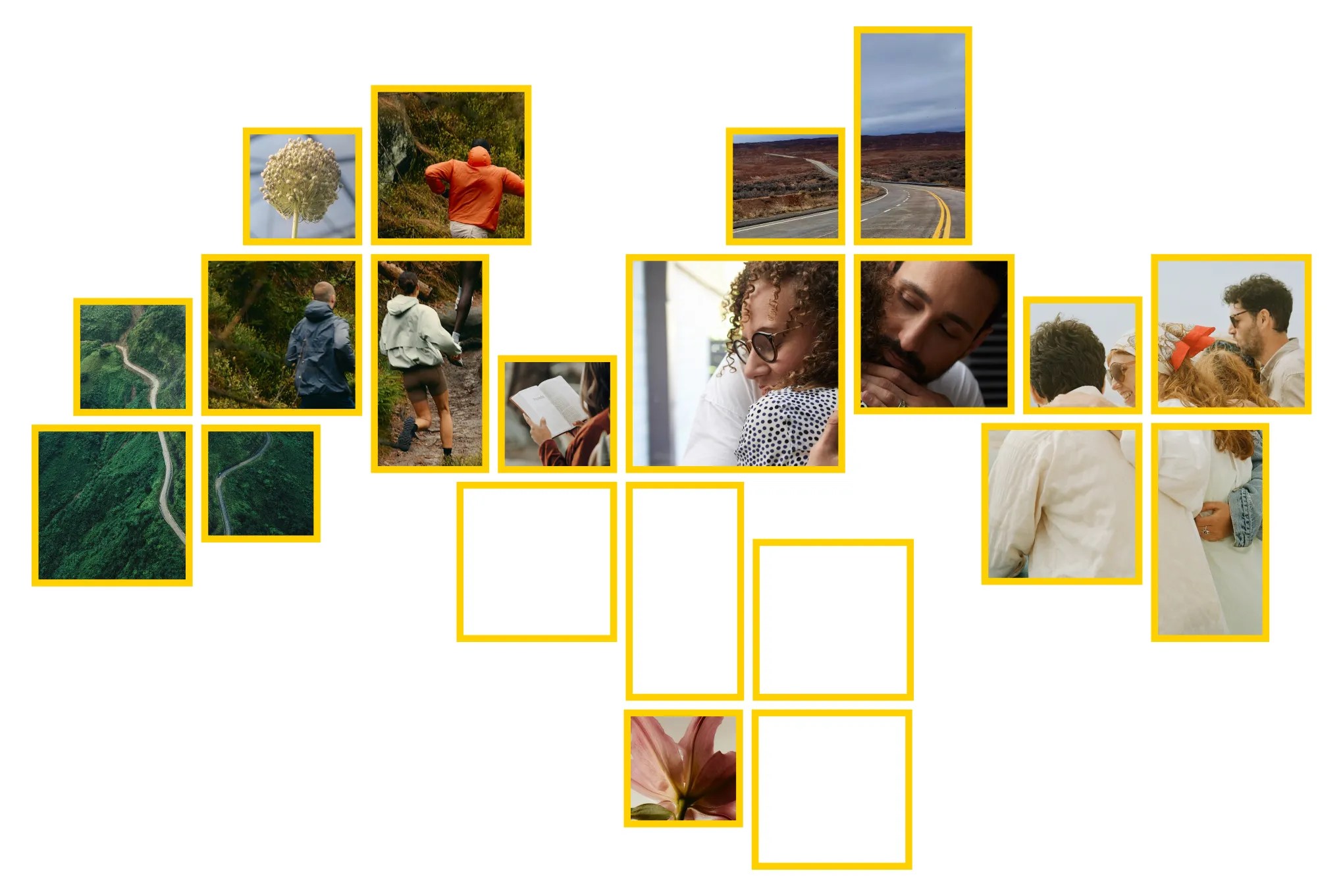
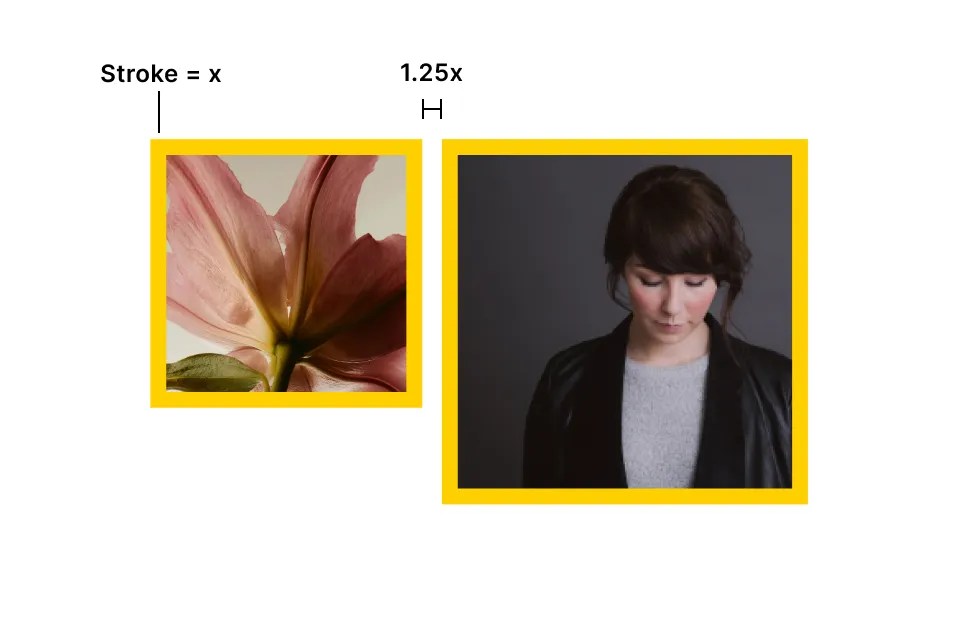
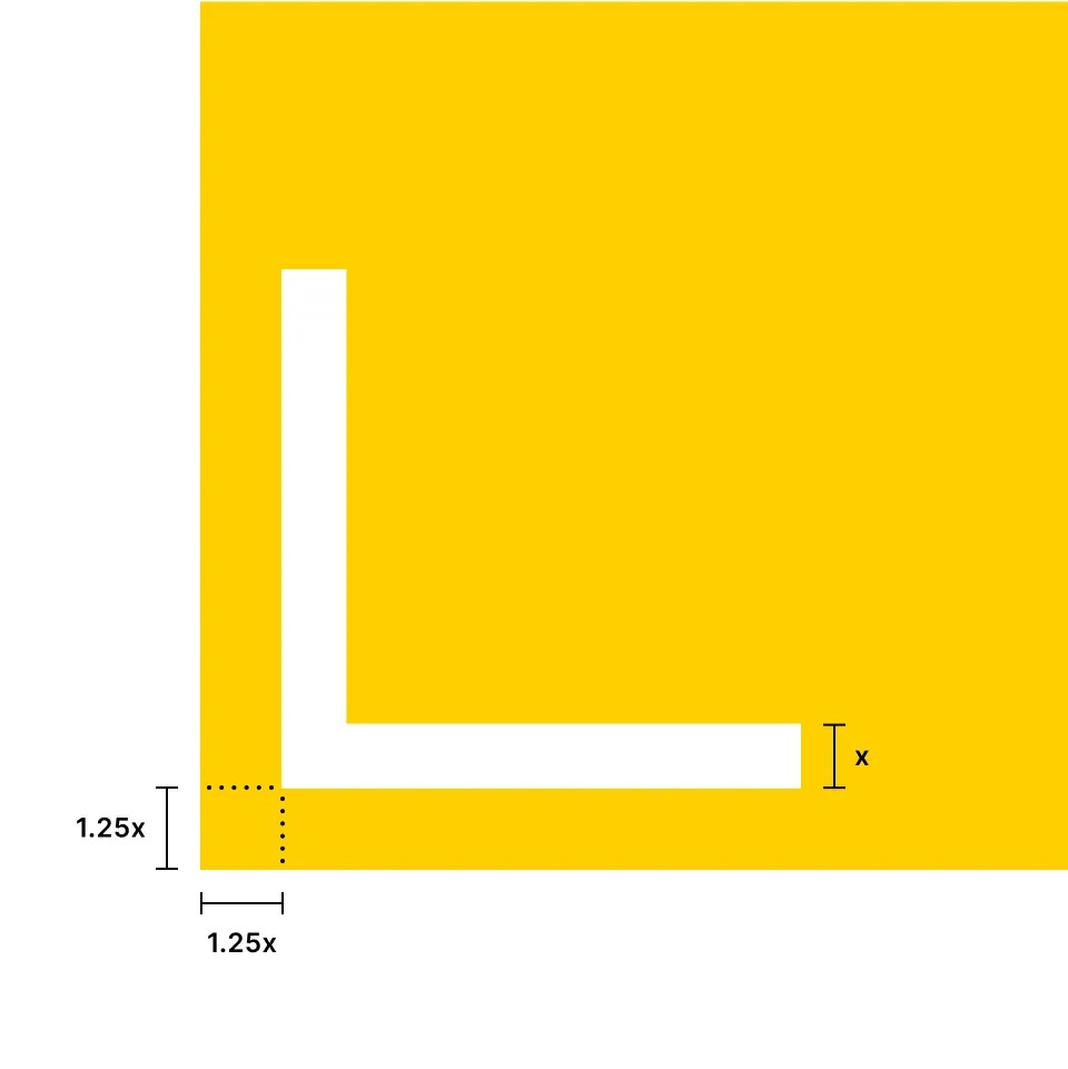
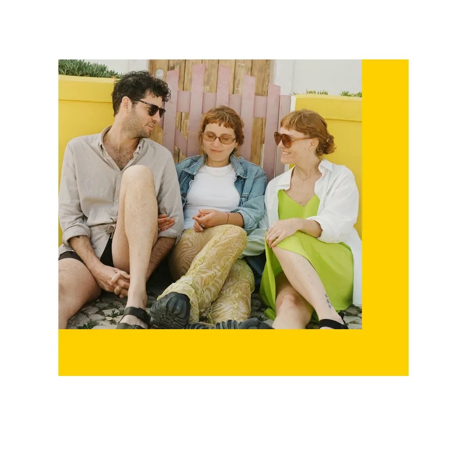
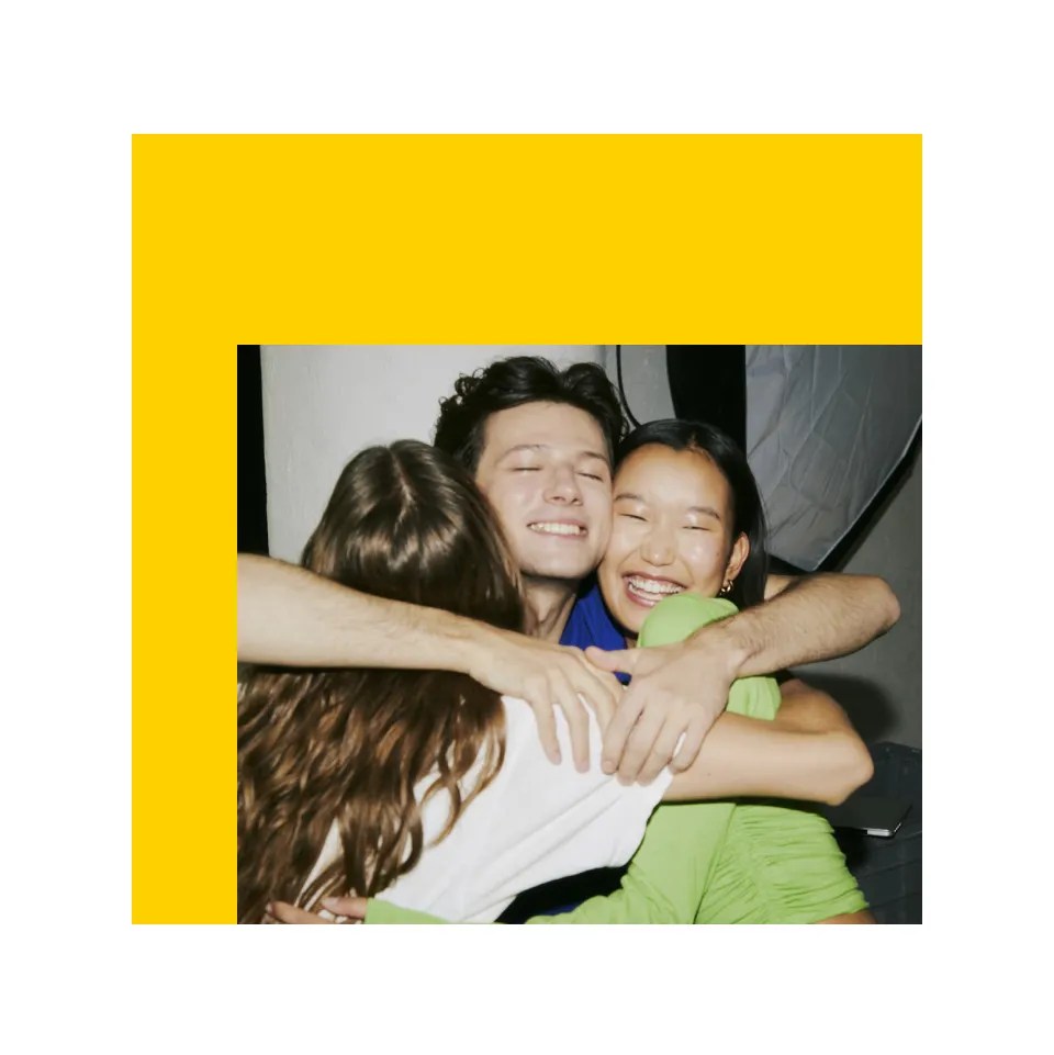
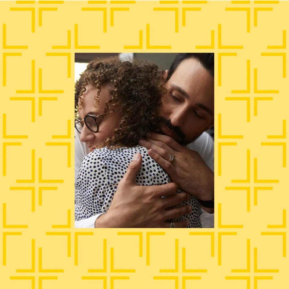
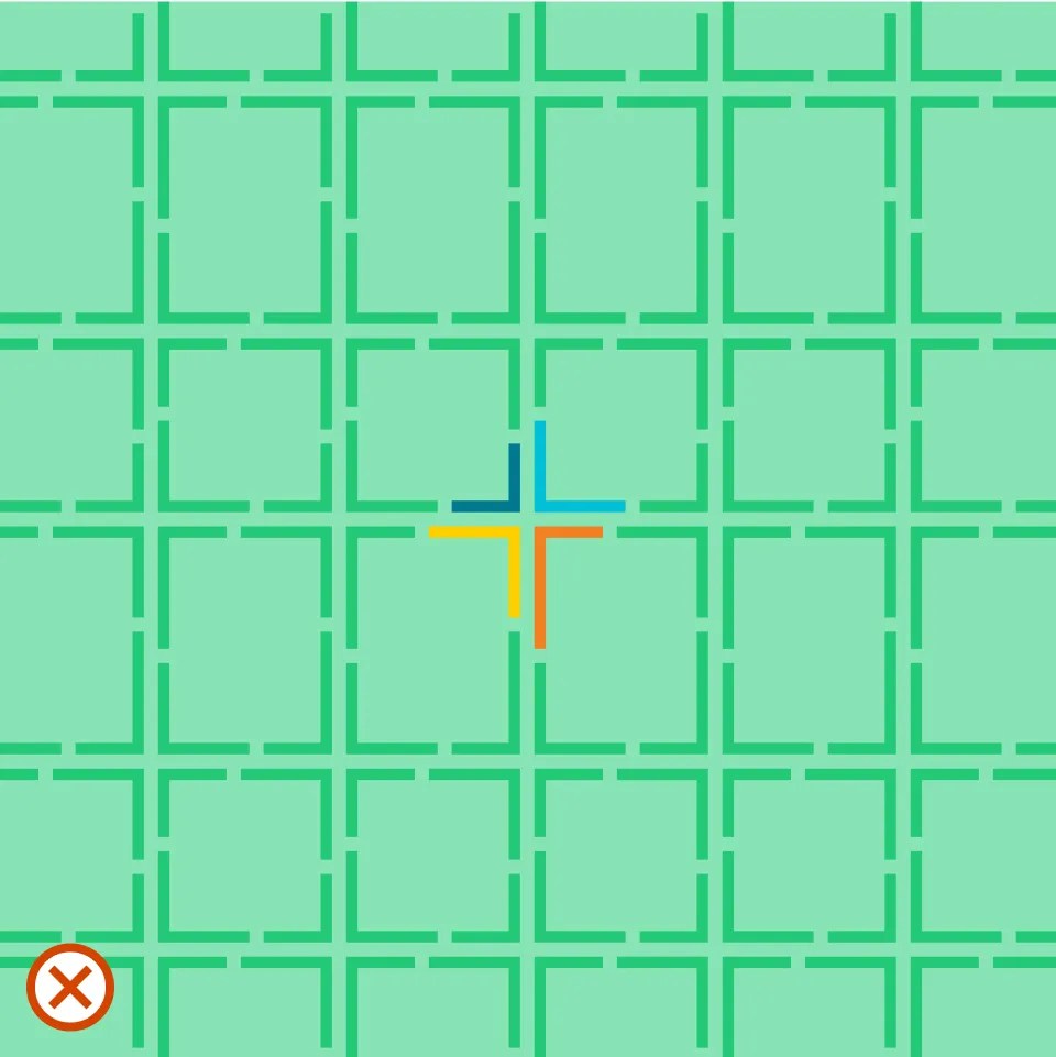
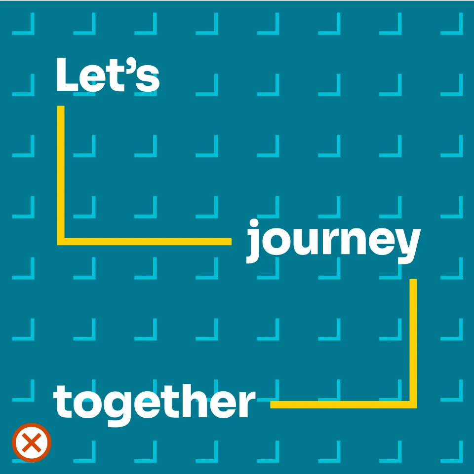
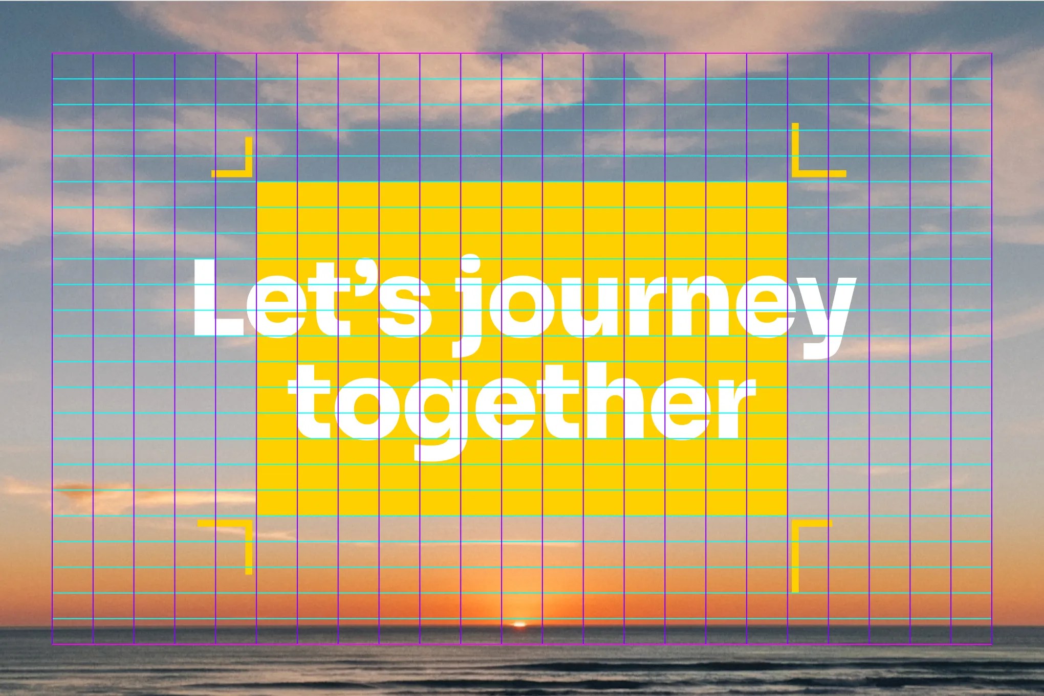
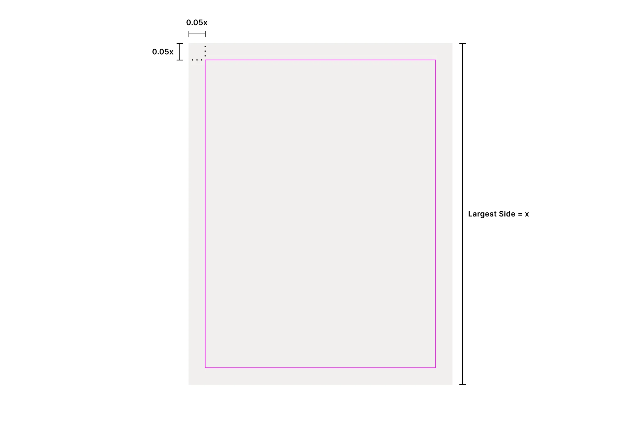
Our elements revolve around the concept of going on a journey with Cru and the many moments along the way. They are a very powerful tool to help our communications feel “on brand,” even when the brandmark is not around or the tertiary palette is used. Use them consistently and with purpose.
We use Google Material Icons as our default iconography system. Over 2,500 icons are available that are simple, modern, friendly, and sometimes quirky.
Refer to the Color chapter for details on color use with icons.
When using these icons with Cru materials and communications, we recommend these settings.
Recommended Settings
Fill: off
Weight: 400
Grade: 0
Optical Size: 24px
Style: sharp
For those rare situations where a needed icon doesn’t exist, a new icon may be designed. Icons are designed on a 24×24 pt grid. Refer to Google’s icon design principles for more information.
The examples shown here illustrate incorrect uses of iconography.
- Don’t stretch or manipulate.
- Don’t alter the size relationship.
- Don’t outline.
- Don’t size inconsistently.
- Don’t add drop shadows or effects.
- Don’t use imagery or texture as a fill.
- Don’t use more than one color.
- Don’t use gradients.
- Don’t use with inadequate contrast.
Cru’s primary and most distinctive supporting visual element are the corner anchors. They are an extremely versatile tool and can conform to almost any layout or situation.
The corner anchors are directly derived from our Symbol. When the corner anchors are used with motion or animation, they can close together to form the symbol.
Use the corner anchors to emphasize content in a recognizable way to the Cru brand.
Corner anchors may be used with solid fields of color or with text.
When using with text, only apply corner anchors to large text such as headlines or titles.
The stroke width of the corner anchors determines the spacing from a field of color and text.
Fields of color are spaced 0.625 times the stroke weight of a corner anchor.
Text is spaced 2 times the stroke weight of a corner anchor.
The examples shown here illustrate incorrect uses of corner anchors.
- Don’t make corner anchors too small.
- Don’t make corner anchors too big.
- Don’t outline.
- Don’t space incorrectly.
- Don’t size unevenly.
- Don’t add drop shadows or effects.
- Don’t use more than one color.
- Don’t use gradients.
- Don’t use with inadequate contrast.
Symbol windows are another distinctive visual tool of the Cru brand identity that is flexible and dynamic.
One or multiple corners of the symbol may be used to stretch out a window into photography. Use the symbol window to tell a story using photography or to show a look into the world of Cru.
While a square symbol window is the preferred application, they are very flexible when needed. It’s best to let the photo determine the proportions of the window.
The examples shown here illustrate incorrect uses of symbol windows.
- Don’t make the symbol too small.
- Don’t make the symbol too big.
- Don’t use with solid fill or text.
- Don’t use a different line weight than the symbol.
- Don’t use line weights inconsistently.
- Don’t add drop shadows or effects.
- Don’t use more than one color in an instance.
- Don’t use gradients.
- Don’t use with inadequate contrast.
Connected words let Cru messaging visually tell a larger story about our journey together.
Use connected words for big moments that make an impact on viewers.
It’s best to use short headlines or titles that have three to seven words.
Connected words are flexible in the form they take and can accommodate almost any proportion. Additionally, the right angle “turns” can go over or underneath.
It’s important to apply connected words consistently. Follow the diagram shown here for exact spacing when creating new applications or use the template.
The middle line in connected words should always be in the the exact vertical center of the layout.
Photo collages bring together many ideas and stories into one layout. This treatment should be used sparingly and only when many pieces are needed to come together to form a whole.
Our symbol is used as the basis for sizing and spacing of the photo C=collage. Refer to the diagrams shown here for details.
The frames are derived from the corners of the symbol scaled up 300%.
Right angles from the symbol may be placed in the corners of layouts. This is a great way to emphasize text.
A border or drop shadow may be applied to the photos when needed. This is a great way to emphasize images.
Large blocky compositions are made with fields of colors to divide up background from image. The fields can become places for text to reside, if needed.
Refer to the Grid section for details on creating compositions.
Patterns are another visual tool that can be used to add some fun or creativity to designs.
There are six different patterns available and nearly endless color combinations.
Refer to the color pairs section in the Color Chapter for more information on color application.
Photography may be applied over a pattern as long as they fall in line with the pattern. Make sure images do not overlap parts of the pattern.
Do not emphasize the symbol in the patterns. Also, do not use any other elements with patterns.
Our grid is an optional tool for designing layouts that have a sense of structure and hierarchy. It allows for relationships to be created throughout the composition and for messaging to be clear and digestible.
Generally, the grid is used to create broad fields for information to reside. It can be thought of as a way to make a starting composition. Once these areas have been established, it’s not important for every single element to fall on the grid.
The first step for applying our grid is to establish the margins. Margins are determining by taking 5% of the largest side of the item in question.
For example, if the item being designed is a letter piece of paper, then the margins would be 5% of 11 in or 0.55 in. You can also achieve this by multiplying the largest side by 0.05.
Once the margins have been established, then the columns and rows are added in. Divide the horizontal and vertical space in 23 equal columns and rows. Do not do any amount other than 23 and do not apply any amount of gutter.
Because of the flexible nature of the grid, it can be applied to an item of any ratio.
Several examples of how the grid can be used to break up information are shown here. These examples are only meant as a starting point, and a nearly endless amount of compositions can be created. Consider the content when creating a composition, such as the headline, copy, imagery, icons, and other elements. Use one column or row when separating content.