Imagery plays a major role in communicating to our audiences. The more authentic they are, the better. Limit the use of “staged” or “posed” shots.
Our photography is categorized into two unique styles, “The Journey” and “Warm Moments.” However, it’s important to know your context. Seek images that speak to your audience and communicate the story you are telling. These styles are flexible and act as a starting point for general communications.
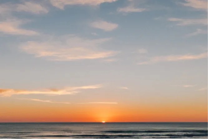
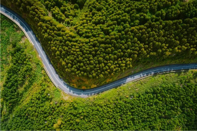
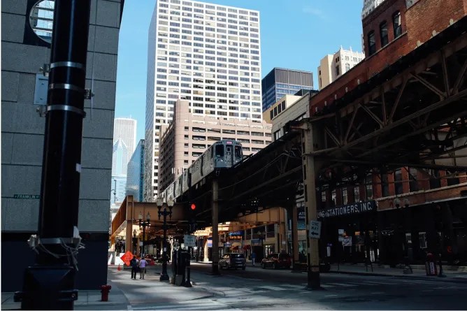
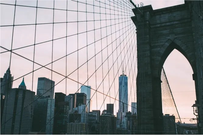
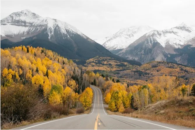
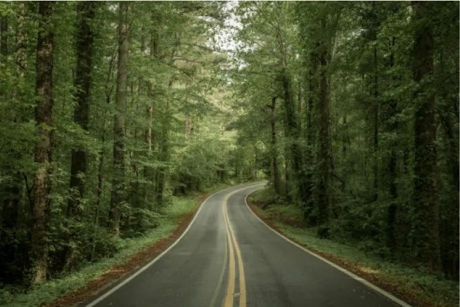
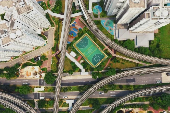
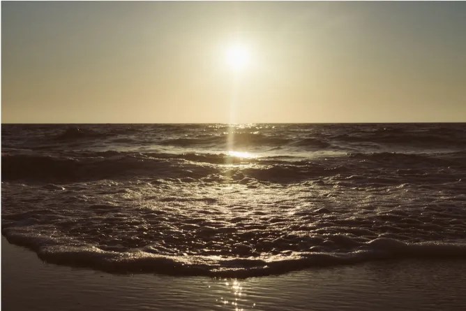
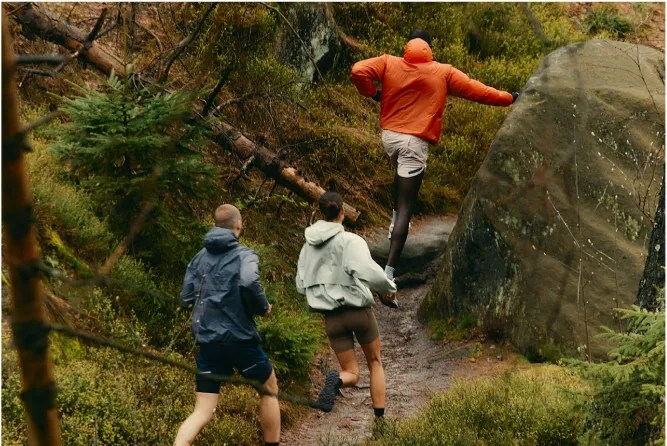
“The Journey” photography zooms out on the world we all traverse, highlighting the pathways nestled within beautiful landscapes and bustling cities. These images are artfully composed and do not feature people. They can be thought of as a way to emphasize our brand promise.
Mood: comforting, immersive, wondrous
Visual style: soft, grainy, warm white balance, 35 mm film
Subject matter: landscapes, cities, the ocean, little or no people
Themes: perspective, facing challenges, introspection, movement, the big picture
Disclaimer: All images shown are not licensed and are shown only as an example. Licensing must be obtained before use in any external-facing communication.
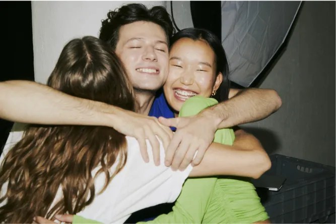
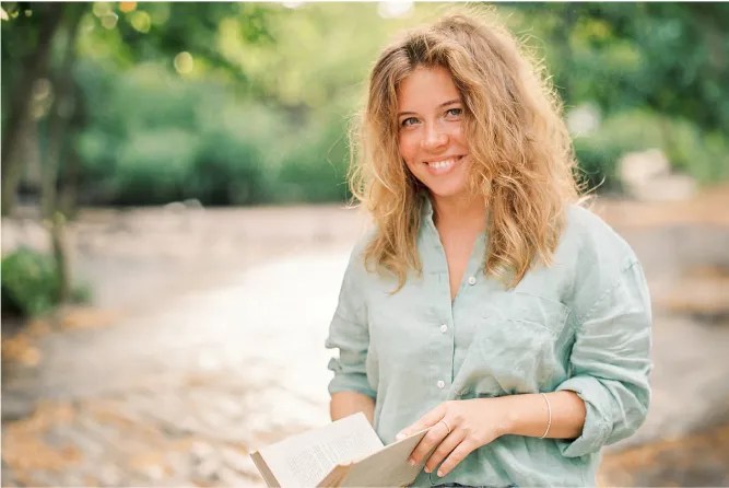
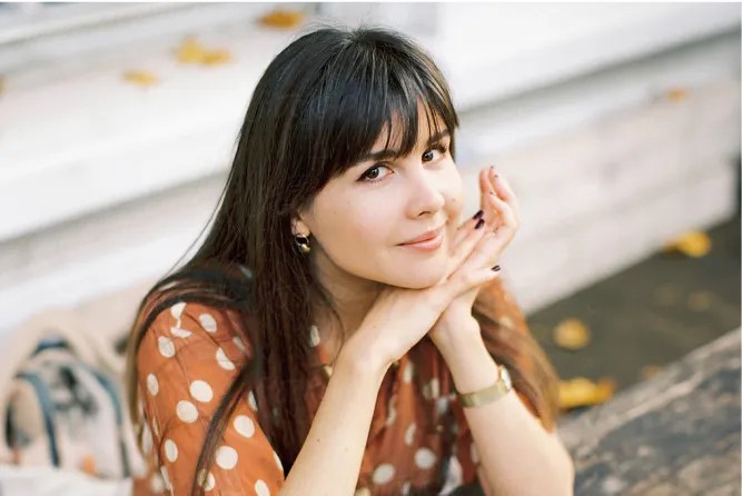
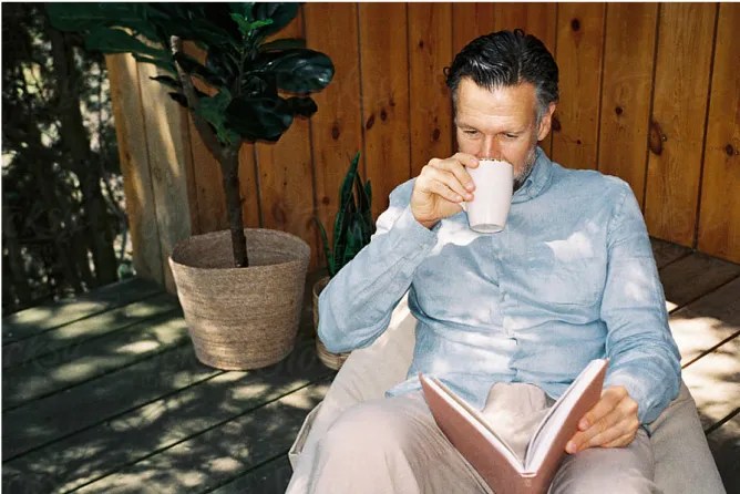
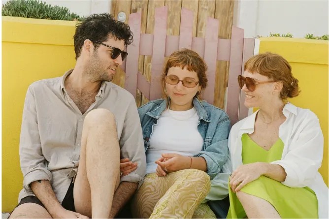
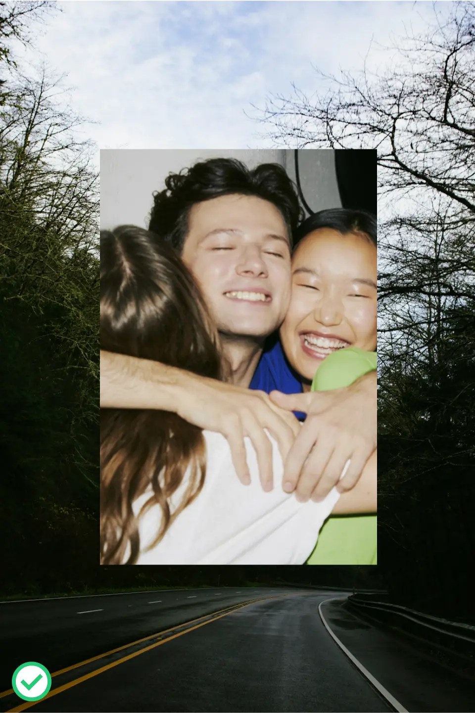
“Warm Moments” photography features people who are excited and content to live life. These images capture the love our believers have for themselves and others around them. Shots should feel candid, featuring natural and genuine expressions at emotional moments. Consider diversity in gender, age, and ethnicity when selecting imagery.
Mood: warm, happy, focused, loving
Visual style: soft, grainy, warm white balance, 35 mm film
Composition: candid, close-up, unique perspective
Subject matter: target audience
Themes: group effort, enjoying life, support, celebration
Whatever photo you use, consider:
- Utilizing Cru Stock.
- If photos are to be personally taken, a proper photo release must be signed.
Disclaimer: All images shown are not licensed and are shown only as an example. Licensing must be obtained before use in any external-facing communication.
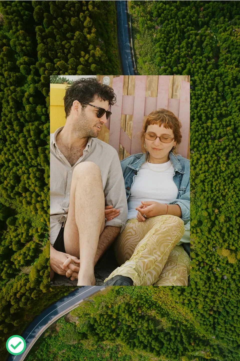
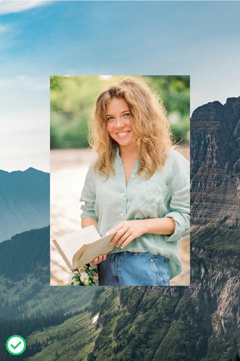
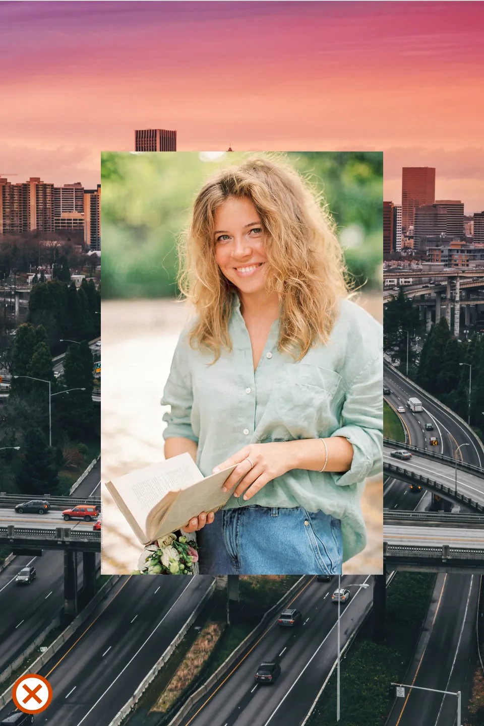
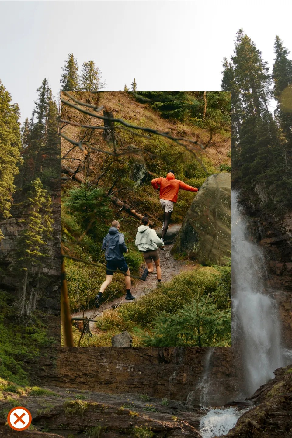
Special care should be taken when layering photography. It’s important to be mindful of subject matter, brightness, color, and texture when layering.
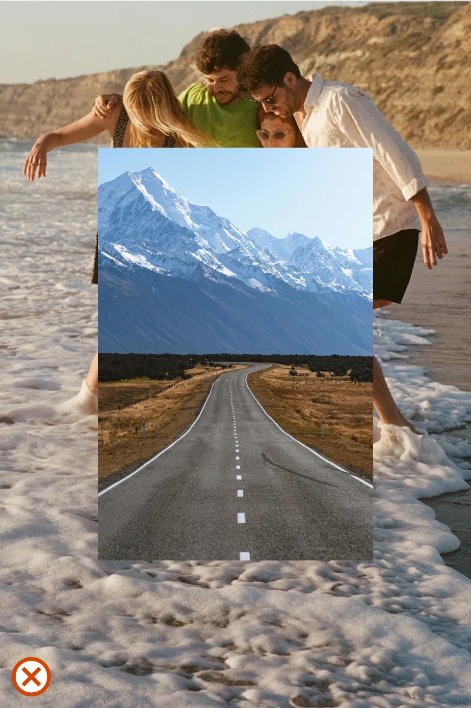
Always feature Warm Moments photography on top of The Journey photography, never the other way around.
Watch out for images that are too visually busy or crowded. It’s best to choose images that are simple and not complex.
Be mindful of texture and color between layers. Make sure the top image has a distinctively different texture than the bottom. Different color and brightness can help make the top image look more legible.
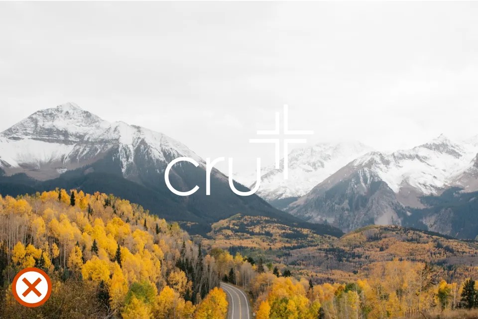
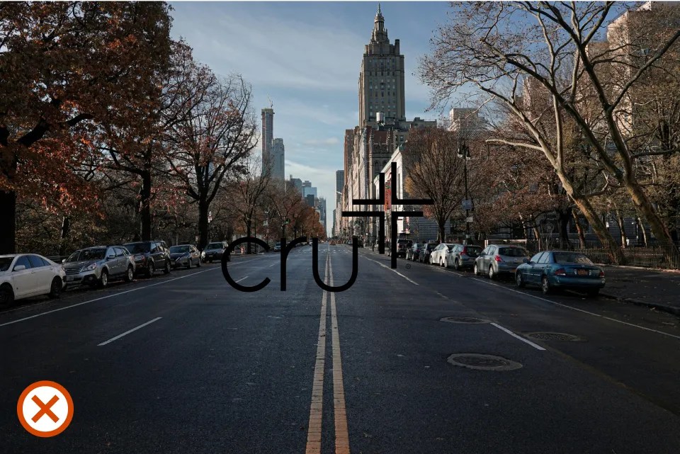
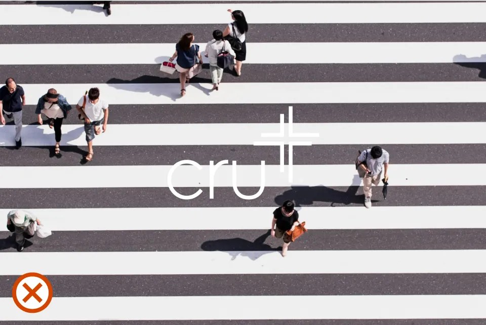
When placing the brandmark over photography, ensure legibility is maintained. Use the white brandmark on dark photos and the black brandmark on light photos.
Avoid placing the brandmark over complex or busy photos. Do not cover faces with the brandmark.
Do not use either version of the full-color brandmark on photography.
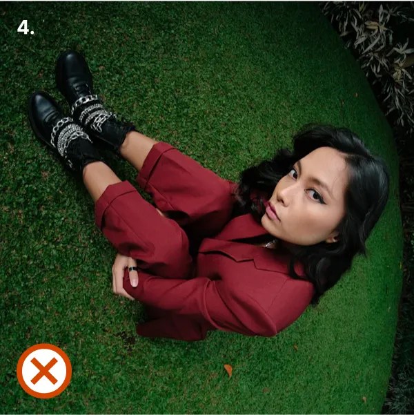
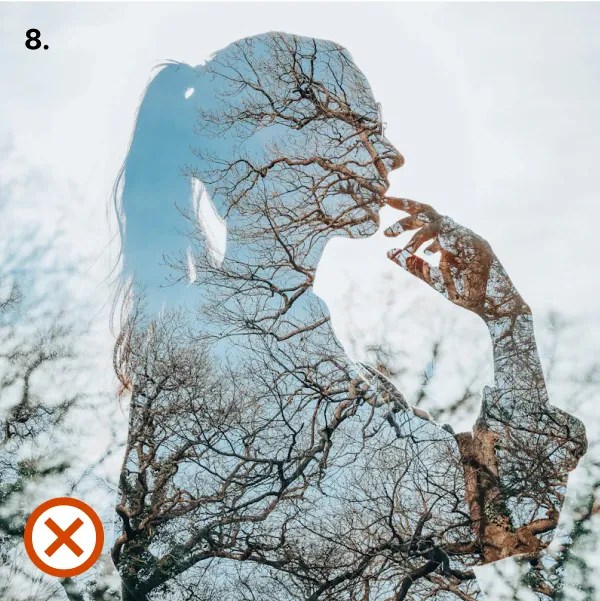
The examples shown here illustrate incorrect uses of photography.
- Don’t use images with exaggerated expressions.
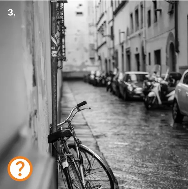
- Don’t use images with poor or harsh lighting.
- Black and white images can often feel somber. Take caution when using them and consider the audience.
- Don’t use images shot with an ultra-wide lens.
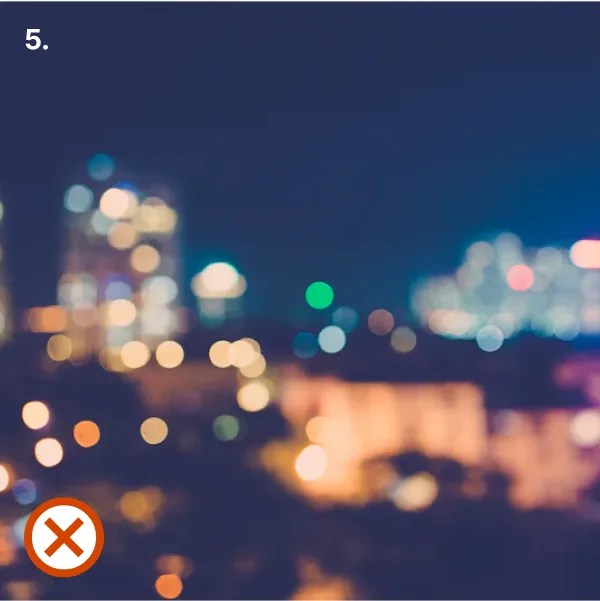
- Don’t use images that are out-of-focus.
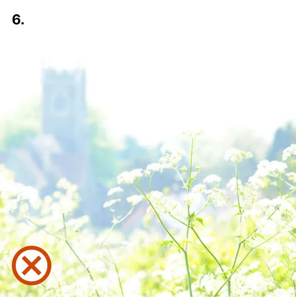
- Don’t use overexposed images.

- Don’t use images with motion blur.
- Don’t use images with special effects or edits.
- Don’t use images without a real background.